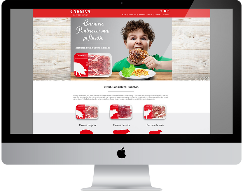
Branding Carniva. Consistent Branding
In general, the food category is very competitive. But the subcategory of red meats is almost invisible. Our client identified this not sufficiently exploited niche and built a brand dedicated to this category. A smart move because a unitary and coherent brand helps you both to position yourself correctly and to gain the consumer's trust.
As with any new brand, it all started with a discussion with the customer. He told us everything about the business, the target audience, and what he wanted from the new brand. Once we understood everything we had to do, we moved on to strategy. Because isn't it, any well-known brand has a solid foundation behind it.
But that didn't come overnight. We started with an analysis of the competition.
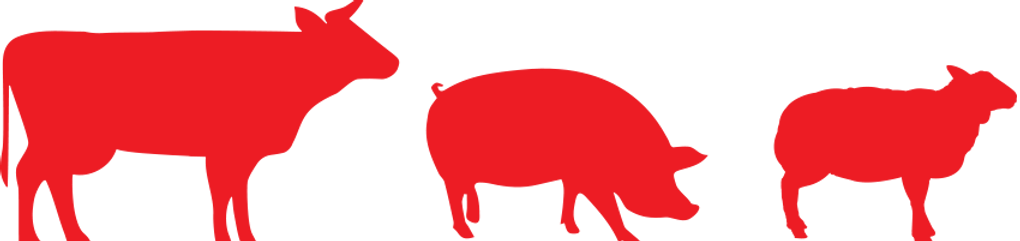
Who sells red meat in Romania? Supermarkets have their own brands and sometimes even their own butchers, small local producers, and so on. It seemed that the territory was quite free. So, together with the office, we toured the stores to see exactly how the situation is in the field.
The final verdict? Not too well. As I said, the market is not consistent and this is clear when you are in front of the window. No manufacturer can boast a branding that attracts your attention or a unitary communication. The packaging also seemed to be left somewhere in the background.
The first step in exceeding your customers’ expectations is to know those expectations.
Roy H. Williams
Then we thought about the consumer. What does he appreciate when it comes to meat? First of all, the traditional butchery. For those who have access to fresh meat, chilled meats are much less attractive. After all, it's normal because you know exactly what you're buying. What you see is what you get.
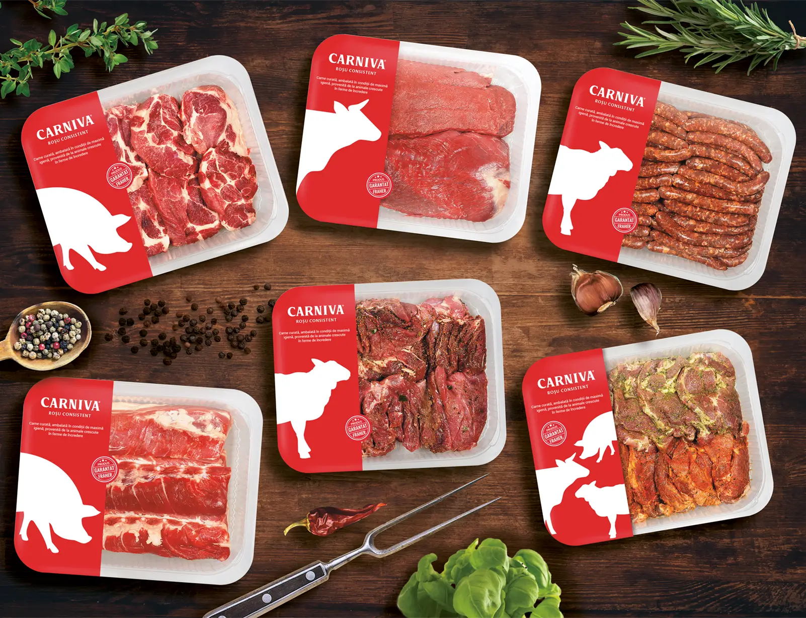
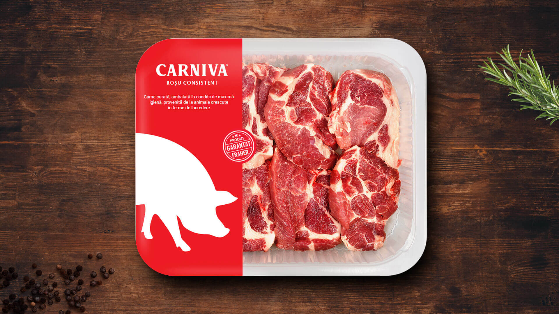
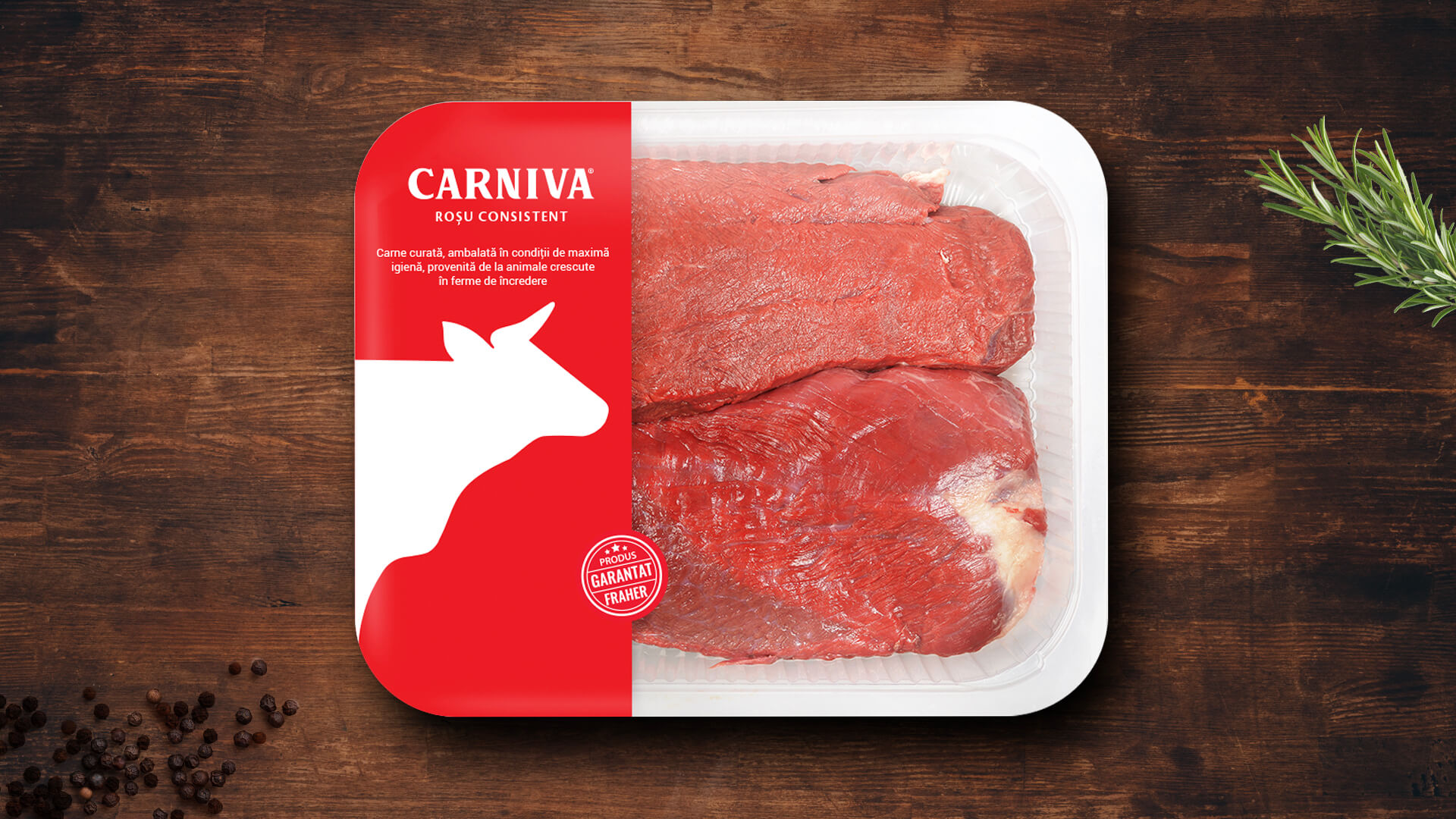
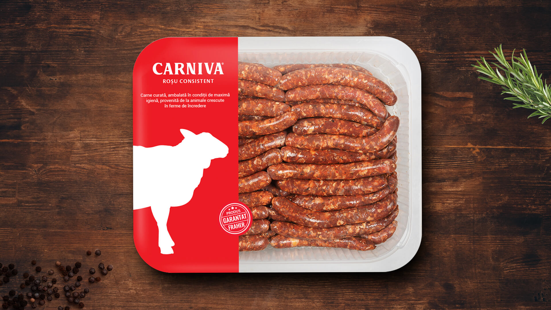
Instead, those who do not have time to shop or have no butcher shop nearby, prefer to buy their meat in a casserole. Not because they like it, but because they have no choice. This is how I came to the conclusion that the average person would appreciate a brand that promises a healthy and clean product.
Another part of the strategy was the slogan. Fraher needed a short but memorable slogan. Something to focus the essence of the brand and pass it on to the consumer. So we thought about the properties of meat. Why do people buy meat? Why consume it? What do you look at the first time you buy a meat casserole?
The answer lies in color. And in consistency, but more in color. The meat is bought because it is nutritious, but the final decision is influenced by color, from intense red to pink, depending on the type of meat. And so the slogan was born - Consistent Red. Thus, the consumer understood that Fraher put on the market clean, healthy and, above all, consistent products.
On the principle of less is more, we chose a strong but very simple font, clean and easy to read.
"Yes, it's bold and simple, but there's another little detail that I liked about this font - some edges of the letters look exactly like a butcher's knife. If you look closely at the R or the V, you'll see exactly what I mean. " Matei Arnautu, Head of Art