Brand identity and package design for a premium bread manufacturer.
A bold local bread manufacturer wanted to promote clean recipes and healthy tradition through their premium bakery products, and they wanted a brand identity and package design to match the business approach.
Preparation Process
Manea Brutarul was the head of bakers' guild in Southern Romania, in the 18th century. Renown for his generosity, he founded a church in Bucharest, and later a street and a borough were named after him. But above all, Manea The Chief Baker fought for keeping his bread clean and pure.
Two and a half centuries later, we brought this story from history books to customers' tables. The charismatic character became the main inspiration for naming and branding the bold local bread company, operating in the Southern side of the country. The similarities extend past the location: just like Manea, the manufacturer is determined to keep tradition alive and craft bread only using the most natural ingredients: dough, water and nothing else - no additives, no taste enhancers. The baking process is slow and natural, and the bread's shelf life is short, in order to respect the health-conscious customers and honor Manea's heritage.
And such a great story needed a strong, yet simple visual approach to match.
Manea The Baker design style stems from the 18th century iconography, with a contemporary twist. Strong lines, borrowed from medieval artwork, symbolize the cleanliness of bread recipe: only dough and water, without enhancers. The visual approach appeals to both traditionalist consumers and discerning customers, while keeping Manea's story alive.
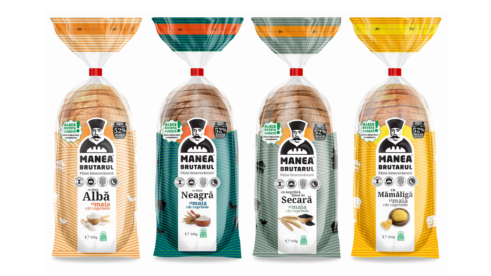
The logo / visual symbol presents Manea's medieval portrait in a contemporary light, by skipping the details and keeping the essentials: the high hat, specific to the Phanariot period, and the bread mark. The firm lines and the heavy font tell the story of tradition and grounded spirituality, with a nod to the inscription on the church founded by Manea in Bucharest, more than two centuries ago.
The tagline "Blessed Bread" is a reference to the strong metaphysical connection between bread and The Divine throughout history, up to the present day, especially in rural areas.
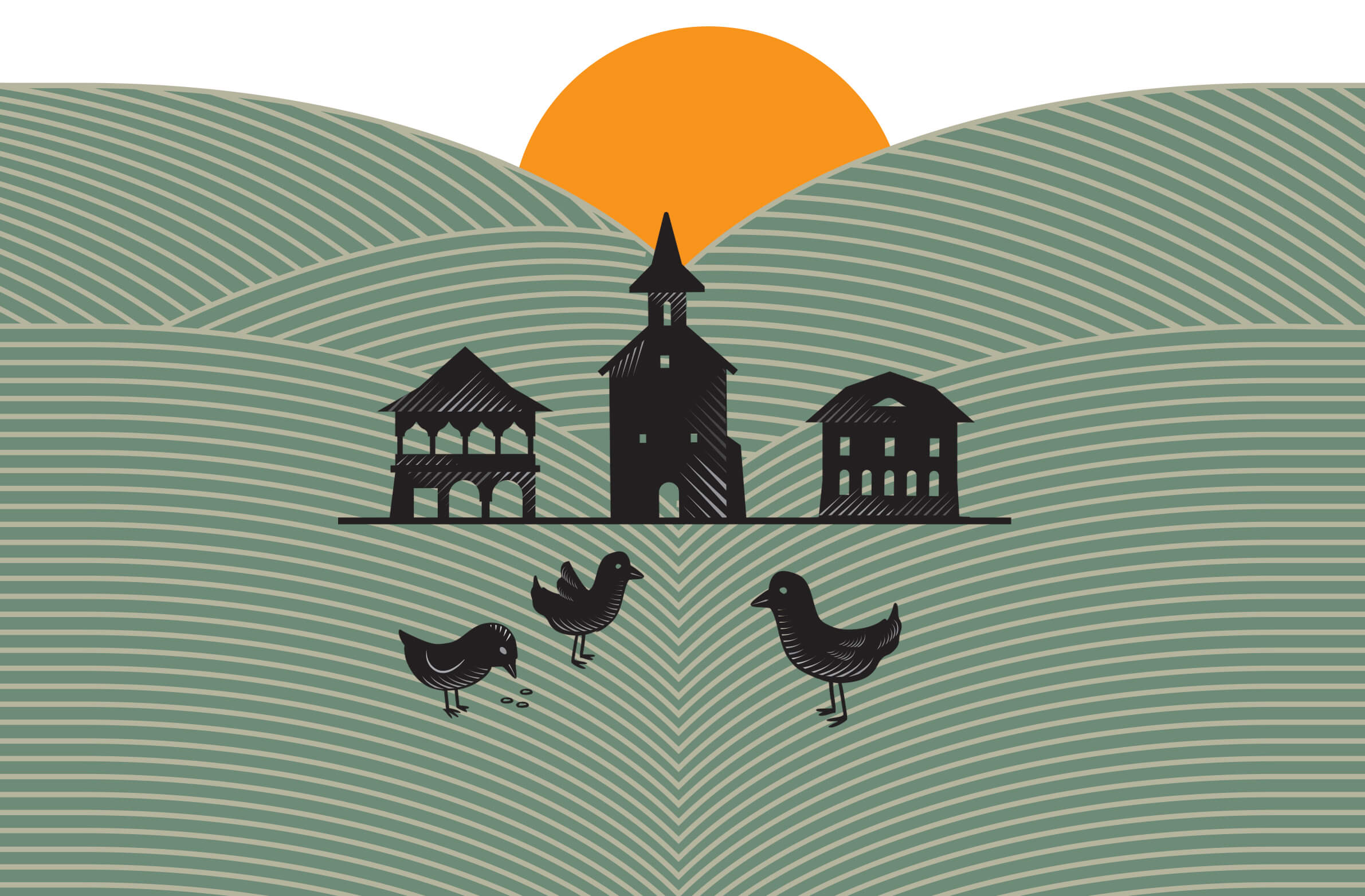
The package design reveals a visual story unfolding under consumers' very eyes: Manea The Chief Baker is placed in a stylized field of grain, with the sun - illustrated almost as a divine halo - ripening the crops on the famously rich Romanian land.
The package design is also functional: icons inform about the bread's main benefits - clean recipe with all-natural, few ingredients, slow baking, short shelf life - whereas the color codes identify the brand and help customers choose their favorite type of bakery product.
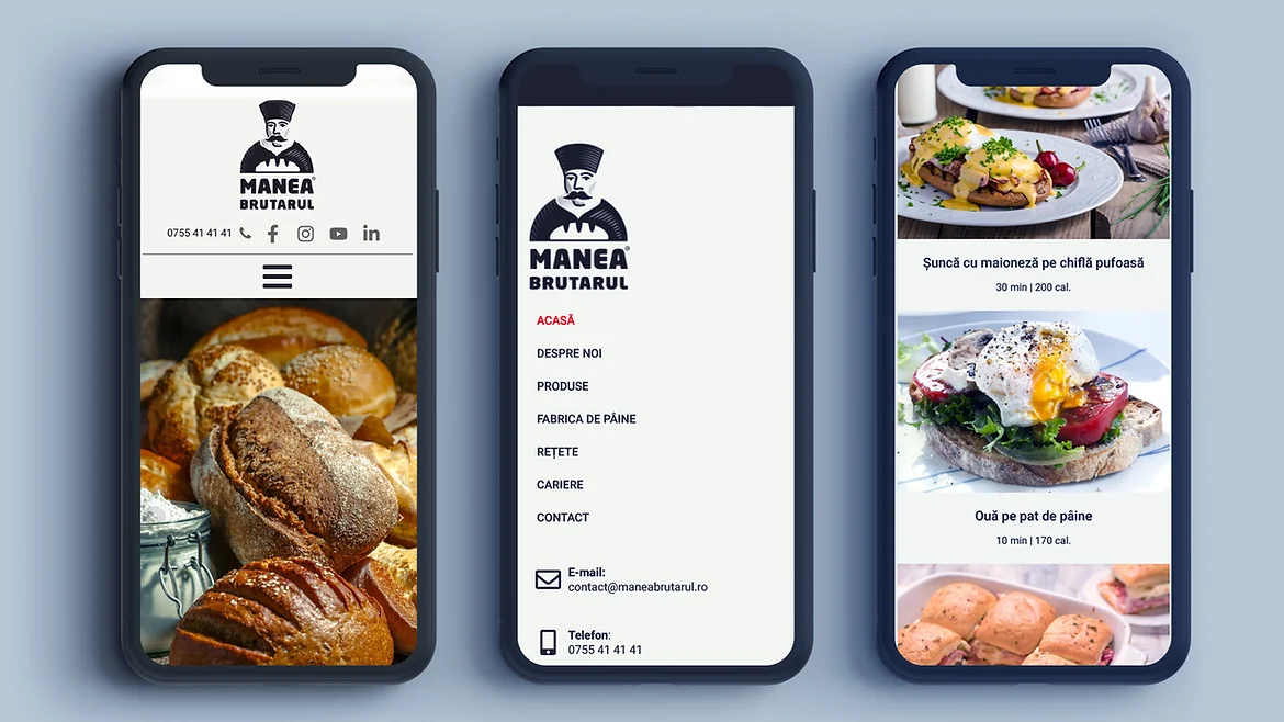
The online branding brings the late-medieval stylistic elements into the 21st century. The website design reiterates the elegant, yet strong simplicity of the brand. The site content extends beyond the portfolio of products: it is a portal to Manea The Chief Baker's world, where visitors can learn about his heritage, the clean traditional bread recipe and the benefits of present-day premium bakery products.
Manea The Chief Baker's story carries on with a strong visual presence, that mixes tradition and contemporary design.