For NABUU, the main challenge was to build a credible visual identity in a highly competitive and sensitive category: eco-friendly laundry detergents. Today’s consumer is far more informed, more skeptical, and much more attentive to detail. Terms like “natural,” “bio,” or “eco” are no longer enough unless they are supported by a coherent, honest, and easily recognizable visual language. From our perspective as a branding agency, the mission was to translate these values into a clear, memorable, and scalable visual system.
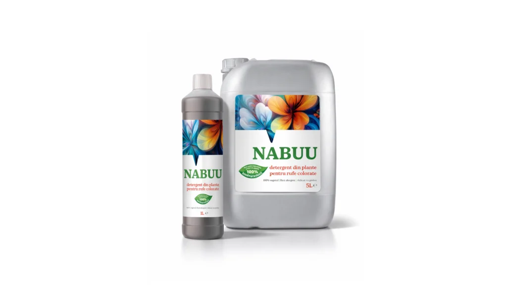
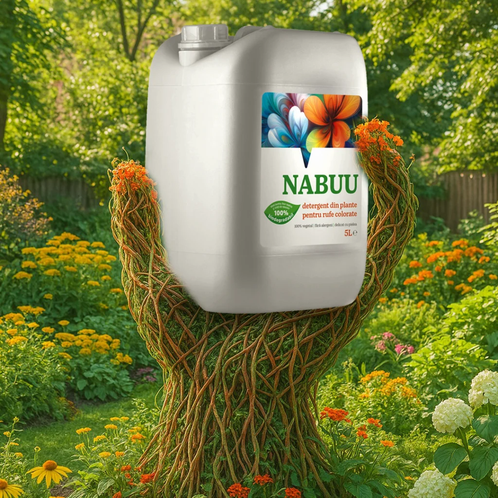
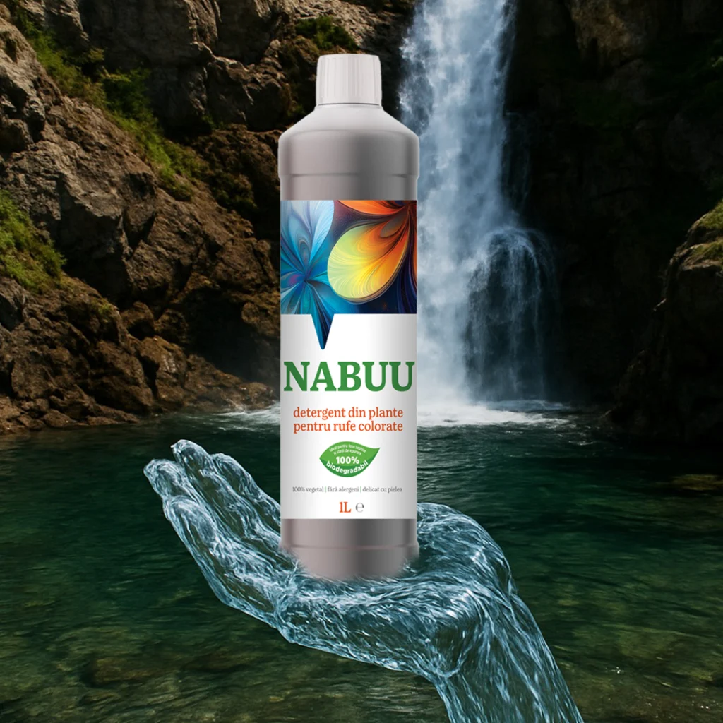
NABUU’s identity is built around the idea of active, living nature—nature that works in harmony with people. We chose a clean, airy visual direction, balancing simplicity with expressiveness. The logo, set in a solid and calm typographic style, conveys trust and stability—essential attributes for a product that comes into daily contact with skin and clothing. The dominant green is not an “eco” cliché, but a carefully calibrated choice that reinforces the brand’s positioning as responsible and transparent.

The key visual element of the identity is the set of stylized floral illustrations, treated differently depending on the product type: full color for colored laundry and monochrome for white laundry. This decision is not merely aesthetic, but strategic. It enables fast differentiation on the shelf, intuitive navigation across the range, and the creation of a coherent visual system that can be easily extended in the future. At the same time, the floral motifs suggest delicacy, plant-based origin, and care—core values embedded in NABUU’s DNA.
The packaging was designed with a strong focus on clarity and visual hierarchy. Essential information is easy to scan, without unnecessary clutter or exaggerated promises. The brand does not “shout”; instead, it communicates calmly and confidently, assuming a mature position in a category where over-communication is common. From our standpoint, this is a clear sign of effective branding: a brand that does not need to constantly justify itself.
Looking at the NABUU project as a whole, the visual identity functions as a business tool, not just an aesthetic exercise. It is a coherent, recognizable, and adaptable system, built for retail environments, future line extensions, and long-term communication. Exactly the kind of identity that not only looks good, but actively supports sustainable brand growth.