Brand identity and package design for a premium bread manufacturer. A bold local bread manufacturer wanted to promote clean recipes and healthy tradition through their premium bakery products, and they wanted a brand identity and package design to match the business approach.
Preparation Process
Manea Brutarul was the head of bakers' guild in Southern Romania, in the 18th century. Renown for his generosity, he founded a church in Bucharest, and later a street and a borough were named after him. But above all, Manea The Chief Baker fought for keeping his bread clean and pure.
Two and a half centuries later, we brought this story from history books to customers' tables. The charismatic character became the main inspiration for naming and branding the bold local bread company, operating in the Southern side of the country. The similarities extend past the location: just like Manea, the manufacturer is determined to keep tradition alive and craft bread only using the most natural ingredients: dough, water and nothing else - no additives, no taste enhancers. The baking process is slow and natural, and the bread's shelf life is short, in order to respect the health-conscious customers and honor Manea's heritage.
And such a great story needed a strong, yet simple visual approach to match.
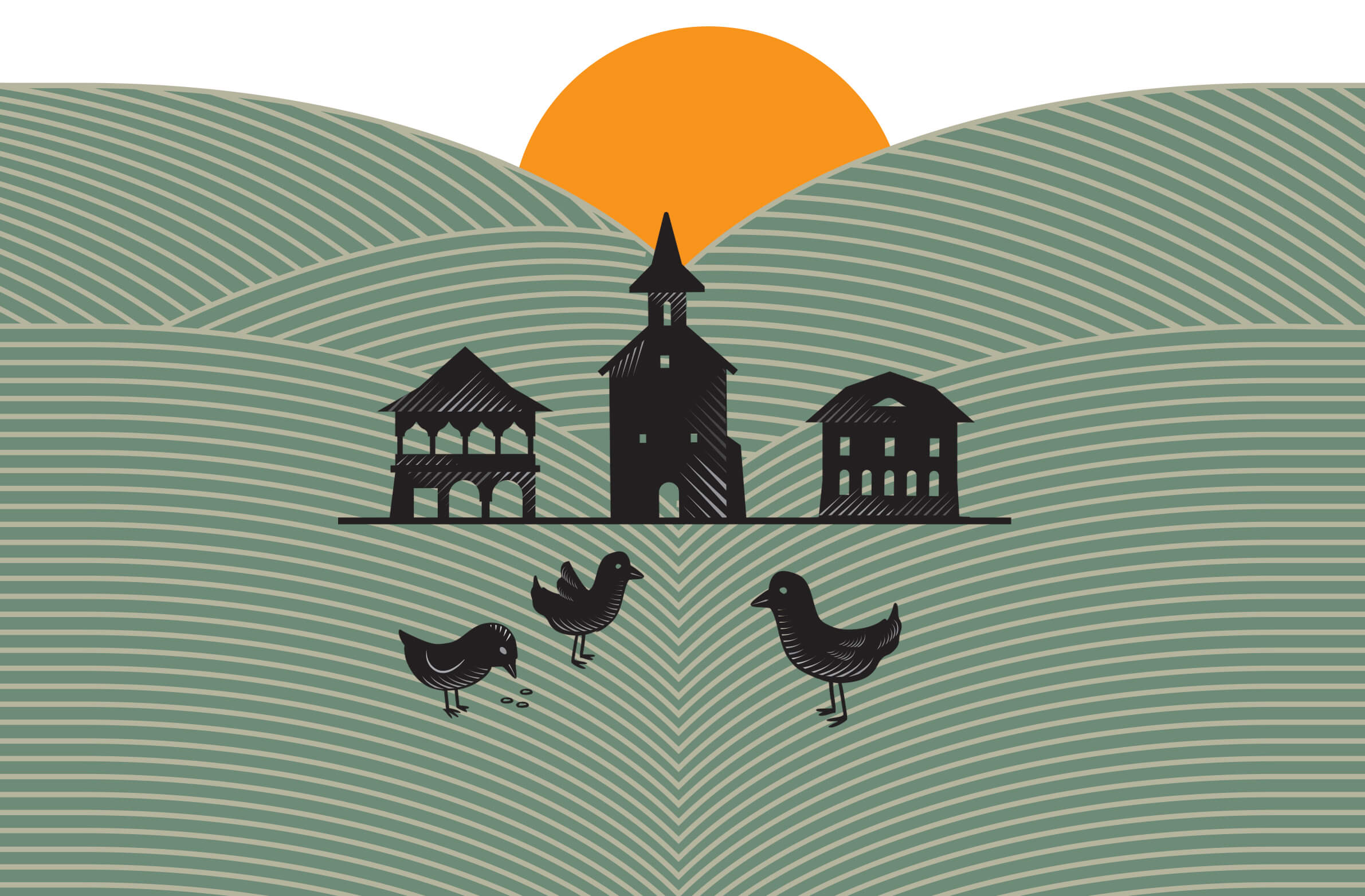
Manea The Baker design style stems from the 18th century iconography, with a contemporary twist. Strong lines, borrowed from medieval artwork, symbolize the cleanliness of bread recipe: only dough and water, without enhancers. The visual approach appeals to both traditionalist consumers and discerning customers, while keeping Manea's story alive.
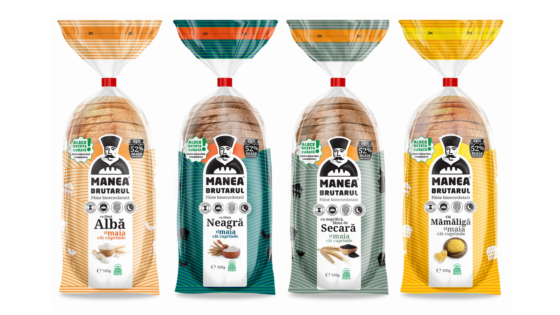
The logo / visual symbol presents Manea's medieval portrait in a contemporary light, by skipping the details and keeping the essentials: the high hat, specific to the Phanariot period, and the bread mark. The firm lines and the heavy font tell the story of tradition and grounded spirituality, with a nod to the inscription on the church founded by Manea in Bucharest, more than two centuries ago.
The tagline "Blessed Bread" is a reference to the strong metaphysical connection between bread and The Divine throughout history, up to the present day, especially in rural areas.
The package design reveals a visual story unfolding under consumers' very eyes: Manea The Chief Baker is placed in a stylized field of grain, with the sun - illustrated almost as a divine halo - ripening the crops on the famously rich Romanian land.
The package design is also functional: icons inform about the bread's main benefits - clean recipe with all-natural, few ingredients, slow baking, short shelf life - whereas the color codes identify the brand and help customers choose their favorite type of bakery product.
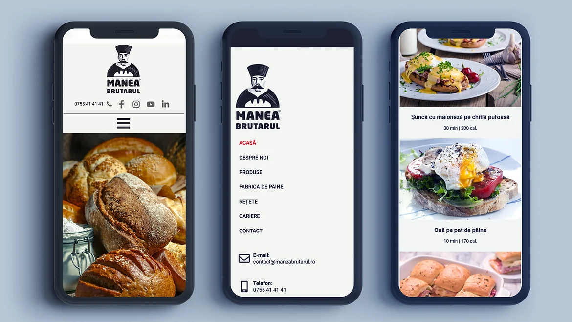
The online branding brings the late-medieval stylistic elements into the 21st century. The website design reiterates the elegant, yet strong simplicity of the brand. The site content extends beyond the portfolio of products: it is a portal to Manea The Chief Baker's world, where visitors can learn about his heritage, the clean traditional bread recipe and the benefits of present-day premium bakery products.
Manea The Chief Baker's story carries on with a strong visual presence, that mixes tradition and contemporary design.
Plantavia is a brand developed by Portalia.ro for the home gardening segment, aimed at individual consumers. People who care for plants at home, on their balcony, or in their garden, and who are looking for simple, effective, and safe solutions. In a category dominated by cluttered packaging and hard-to-understand technical language, our objective was to build a clear, friendly, and easy-to-understand brand for every plant enthusiast.
We started by defining the verbal identity: a warm, optimistic, and guiding tone that inspires care, simplicity, and results. The messaging is direct and practical, avoiding agricultural jargon and unnecessary complexity. Every statement is designed to help the consumer make the right choice and feel confident in the product.
The visual identity is built around clarity and freshness. We used a bright color palette, subtle botanical elements, and a visual structure that emphasizes readability and quick orientation. For the labeling system, we created a modular structure that can be easily extended to future products, with visual coding by plant type and benefits. Each product is intuitive, easy to identify, and immediately communicates its purpose.
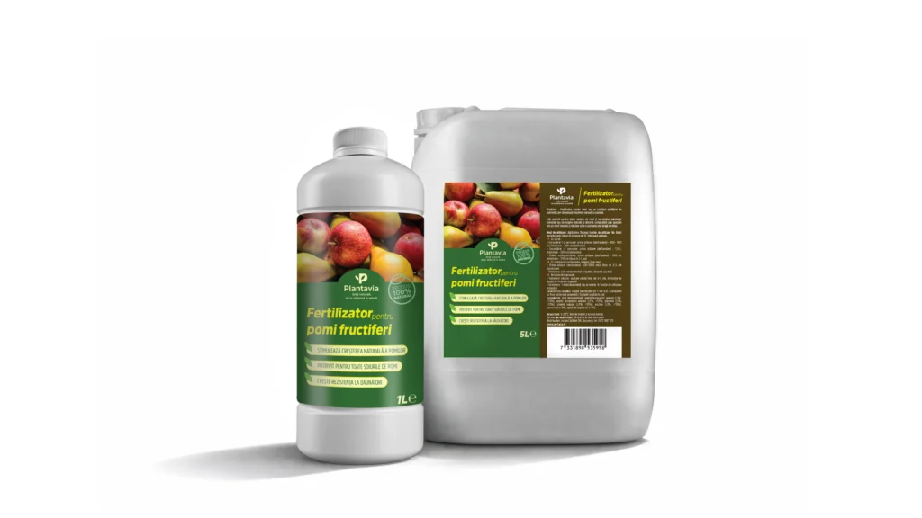
The Plantavia logo is simple, clean, and memorable, evoking the idea of natural growth and care. Together with the graphic system and typography, it communicates a balance between nature, efficiency, and accessibility.
Through brand strategy, verbal and visual identity, the logo, and the complete packaging system, we built a brand that makes gardening clearer, more enjoyable, and more accessible. Plantavia thus becomes a trusted partner for anyone who wants healthy, beautiful plants—from root to petal.

For NABUU, the main challenge was to build a credible visual identity in a highly competitive and sensitive category: eco-friendly laundry detergents. Today’s consumer is far more informed, more skeptical, and much more attentive to detail. Terms like “natural,” “bio,” or “eco” are no longer enough unless they are supported by a coherent, honest, and easily recognizable visual language. From our perspective as a branding agency, the mission was to translate these values into a clear, memorable, and scalable visual system.
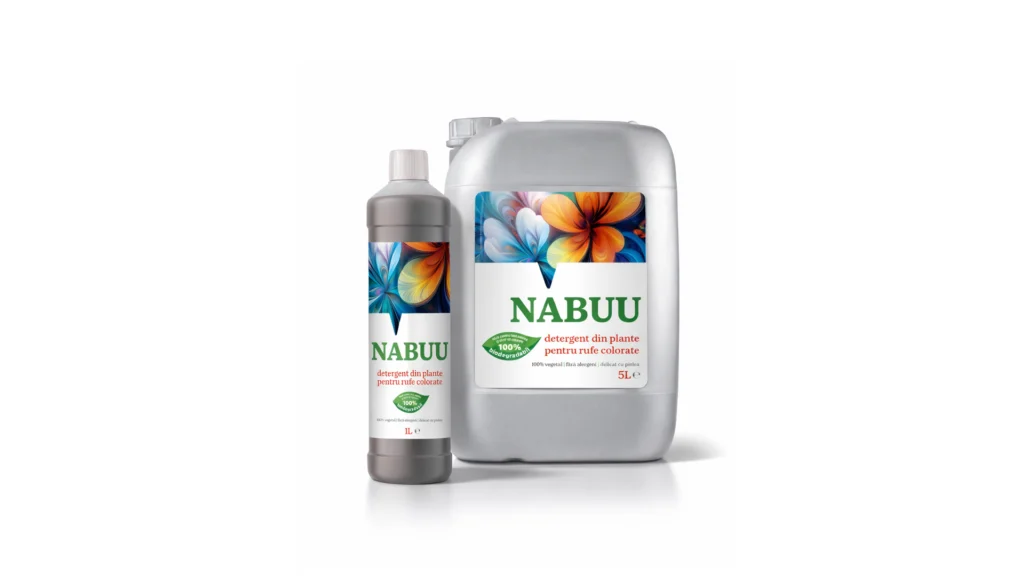
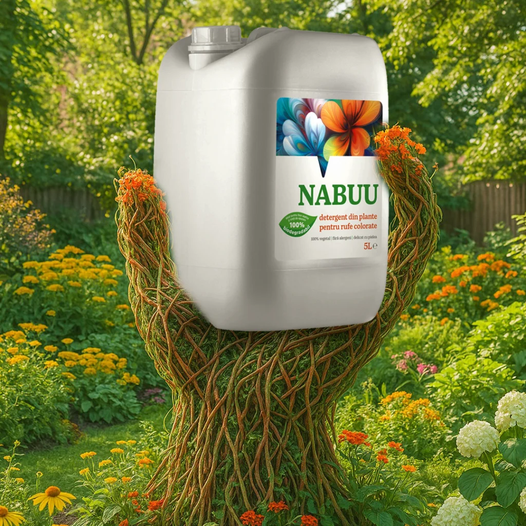
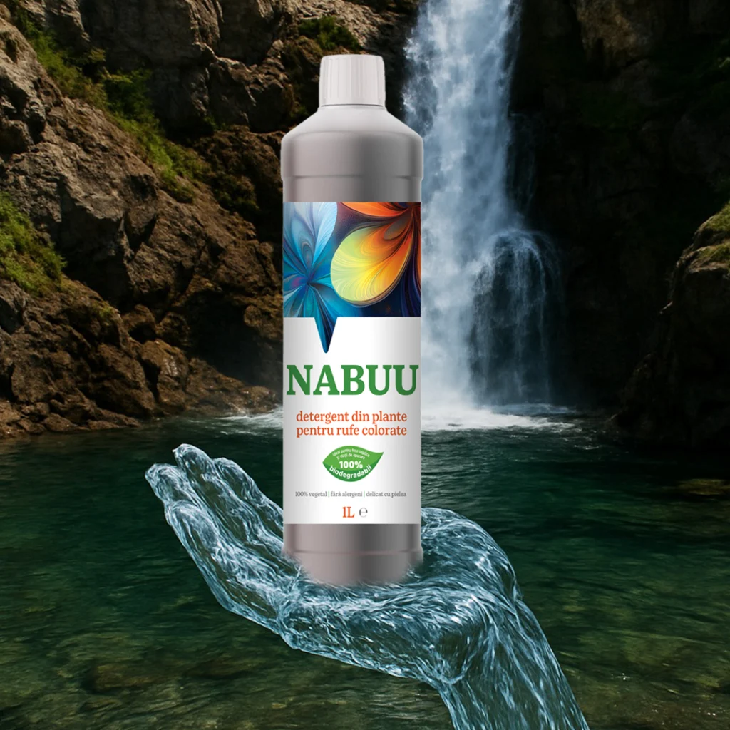
NABUU’s identity is built around the idea of active, living nature—nature that works in harmony with people. We chose a clean, airy visual direction, balancing simplicity with expressiveness. The logo, set in a solid and calm typographic style, conveys trust and stability—essential attributes for a product that comes into daily contact with skin and clothing. The dominant green is not an “eco” cliché, but a carefully calibrated choice that reinforces the brand’s positioning as responsible and transparent.

The key visual element of the identity is the set of stylized floral illustrations, treated differently depending on the product type: full color for colored laundry and monochrome for white laundry. This decision is not merely aesthetic, but strategic. It enables fast differentiation on the shelf, intuitive navigation across the range, and the creation of a coherent visual system that can be easily extended in the future. At the same time, the floral motifs suggest delicacy, plant-based origin, and care—core values embedded in NABUU’s DNA.
The packaging was designed with a strong focus on clarity and visual hierarchy. Essential information is easy to scan, without unnecessary clutter or exaggerated promises. The brand does not “shout”; instead, it communicates calmly and confidently, assuming a mature position in a category where over-communication is common. From our standpoint, this is a clear sign of effective branding: a brand that does not need to constantly justify itself.
Looking at the NABUU project as a whole, the visual identity functions as a business tool, not just an aesthetic exercise. It is a coherent, recognizable, and adaptable system, built for retail environments, future line extensions, and long-term communication. Exactly the kind of identity that not only looks good, but actively supports sustainable brand growth.
We created the name, logo and packaging design for a new veterinary product. Dr. Poop helps pets have healthy digestion and better immunity. The name and visual identity communicates the product's benefits and appeals to cat and puppy lovers.
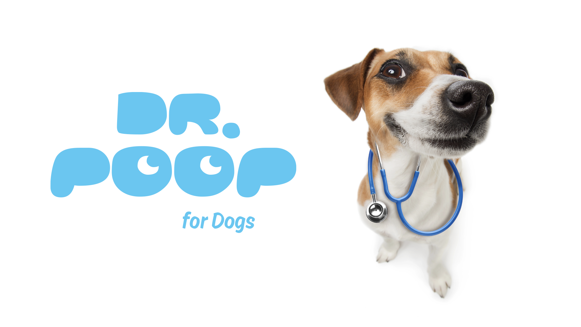
The logo is playful and cheerful. I used the two letters "O" to draw two eyes looking to the right. The letters "P" can be seen as the character's ears.
The new brand is built on the idea of authority / expert, using the particle "doctor", where "Poop" is the area of expertise, of product action. The name has the advantage of quickly expressing what the product range does: it takes care of the animal's digestion & excretion scientifically.
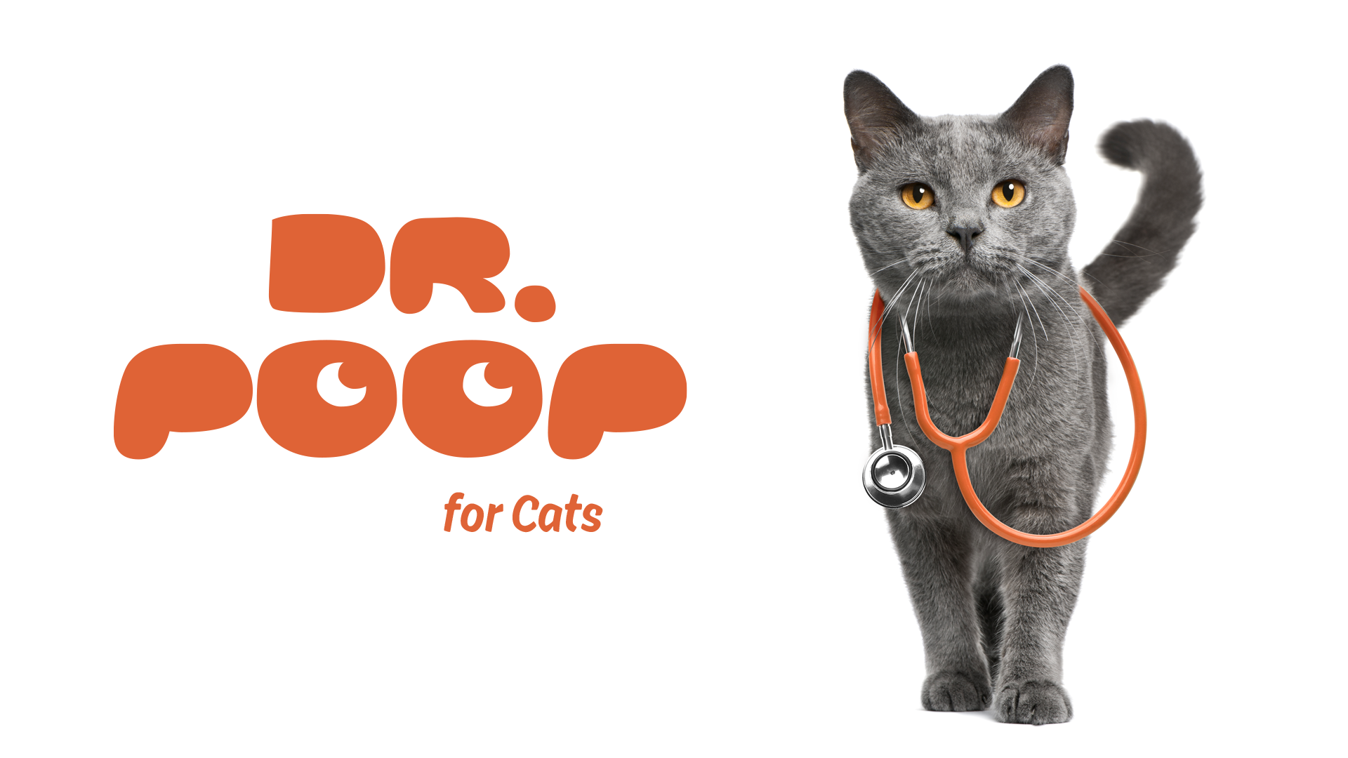
The cat and the puppy with the stethoscope complete the brand's visual identity. Pets know best what they need and offer advice to those interested. I wanted the images to be funny and full of energy, just like the healthy and happy pets.
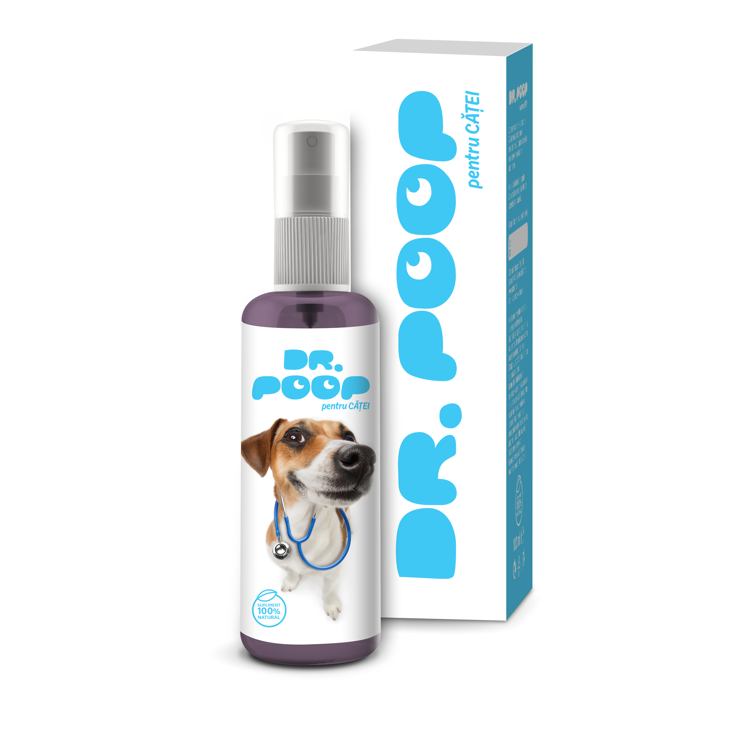
The packaging is simple and clean, the way a puppy owner wants their yard or home to be. We used color differentiation, blue for Dr. Poop for puppies and orange for Dr. Poop for cats to help pet owners quickly identify the different product ranges.
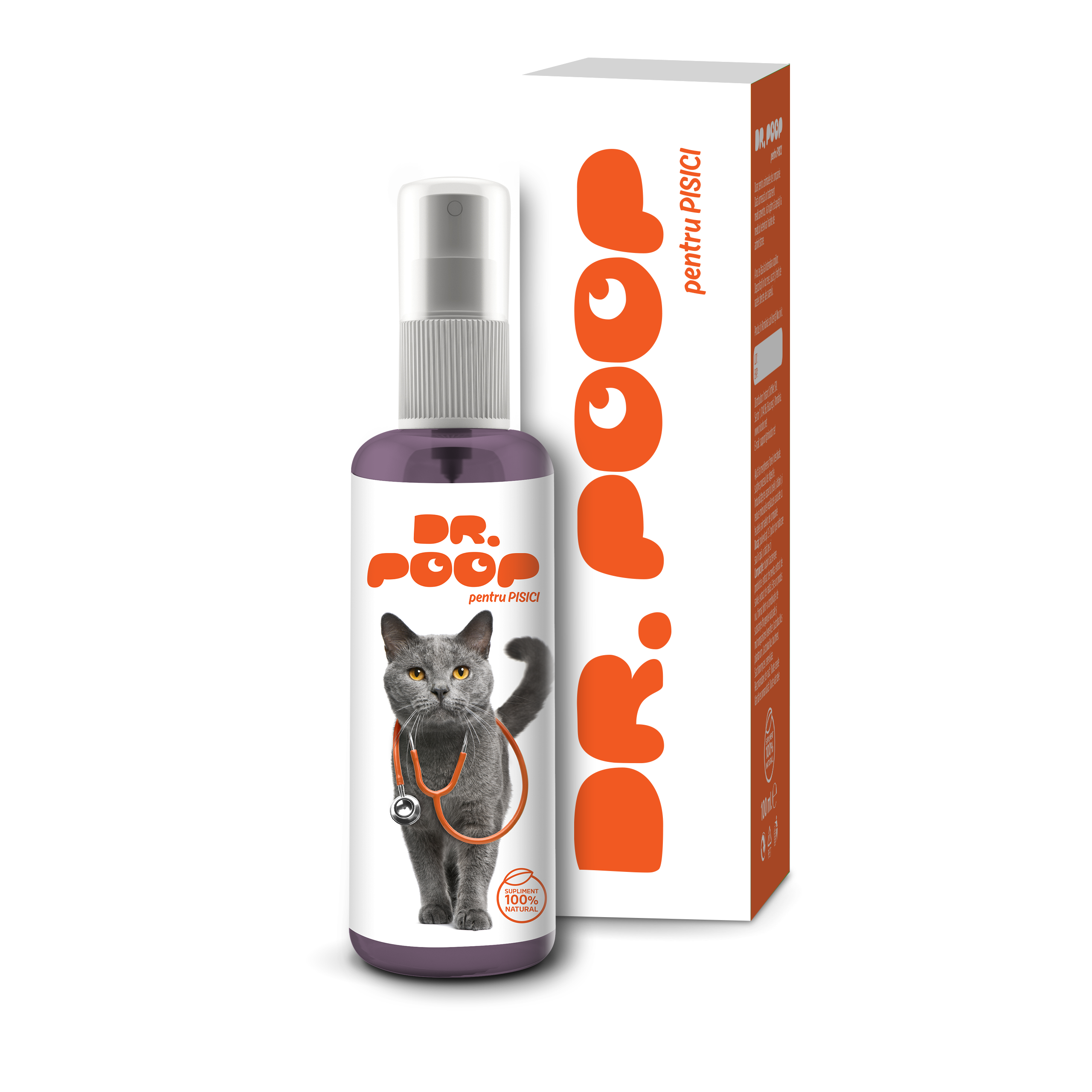
The cat with the stethoscope is an original and memorable image that helps us communicate the benefits of the product and associate the brand with authority in the veterinary field.
BioLocalia Grocery aims to create an ecosystem where small producers connect with local customers. This approach ensures fresher goods, reduces transportation costs, and allows farmers to focus on production while benefiting from a convenient distribution system.
It’s a wonderful initiative that supports local communities and sustainable practices!
BioLocalia’s mission to connect small farmers with local customers is commendable. By doing so, they promote fresher produce, reduce transportation costs, and allow farmers to focus on production while benefiting from an efficient distribution system.
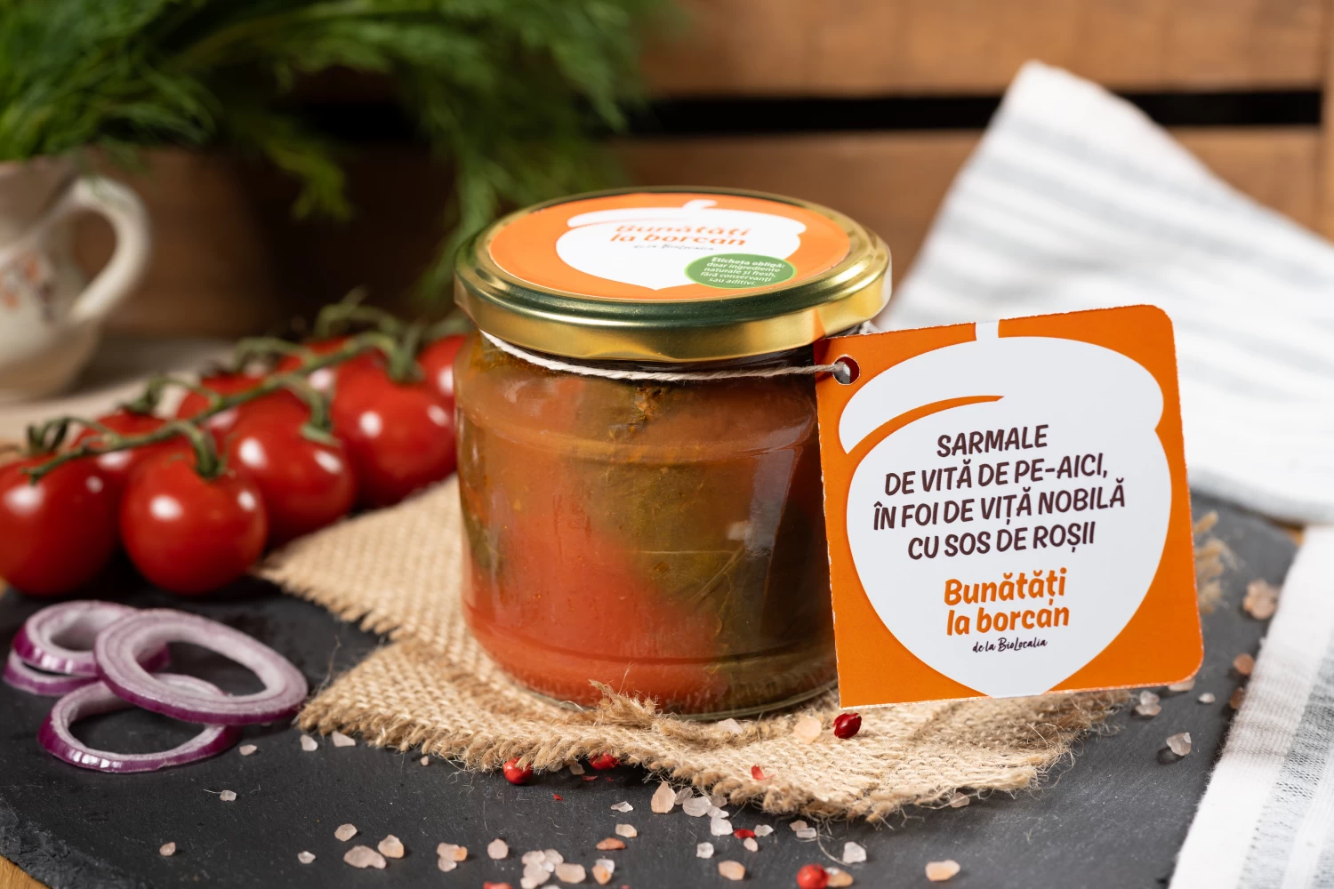
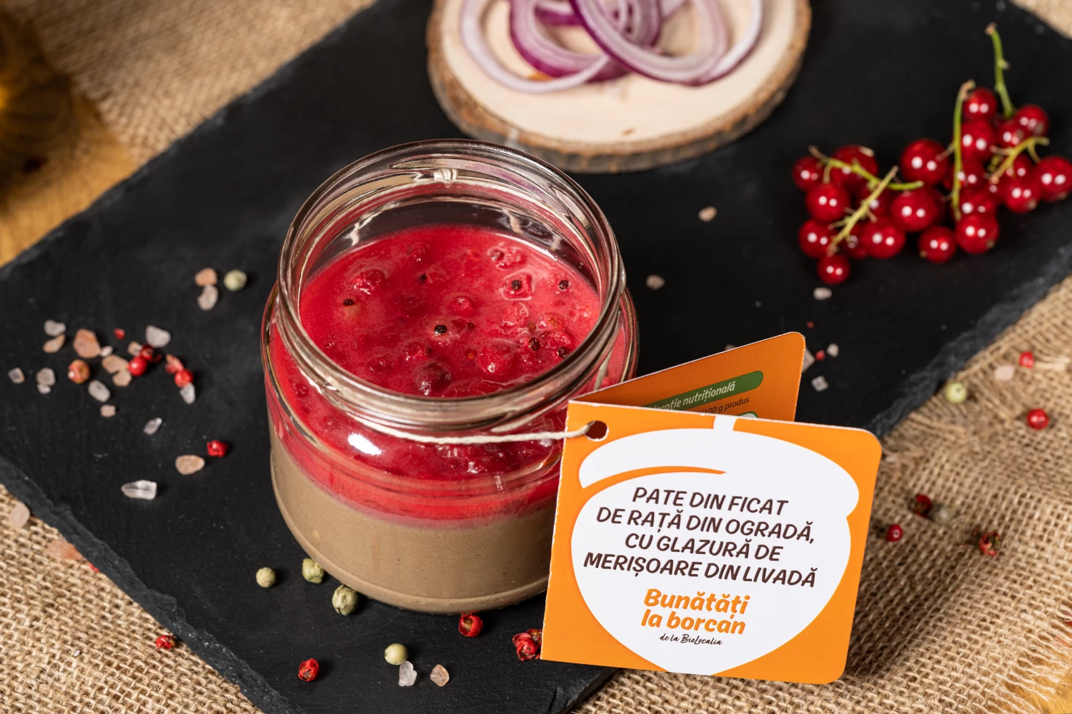
“Bunătăți la borcan” (which translates to “Goodies in Jars”), will showcase the products made by local small farmers. Their target audience consists of busy, educated individuals who prioritize food quality and aim to minimize food waste as much as possible.
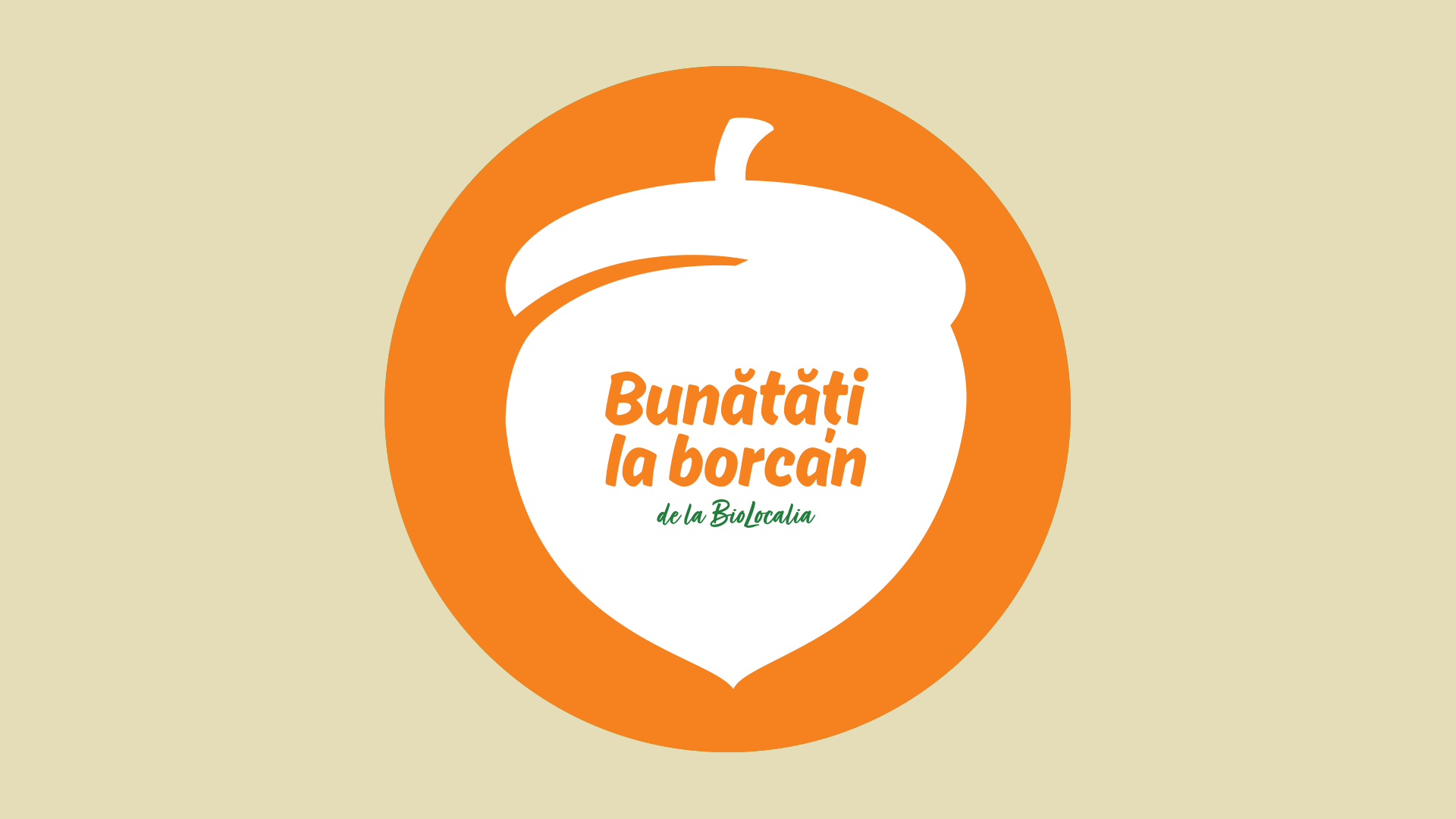
We set out to create a visual identity and message that reflects BioLocalia's passion and dedication to local organic products. Through our design, we want to convey the authenticity and quality of the products, as well as the commitment to the local community. The color range is inspired by nature. Mostly warm colors, in combination with intense green.
The identity package created by Logo Bigger included: the creation of the name, the logotype design, a package of illustrations that will be used to communicate inside the grocery stores and create the promotional materials, package design, and web design.
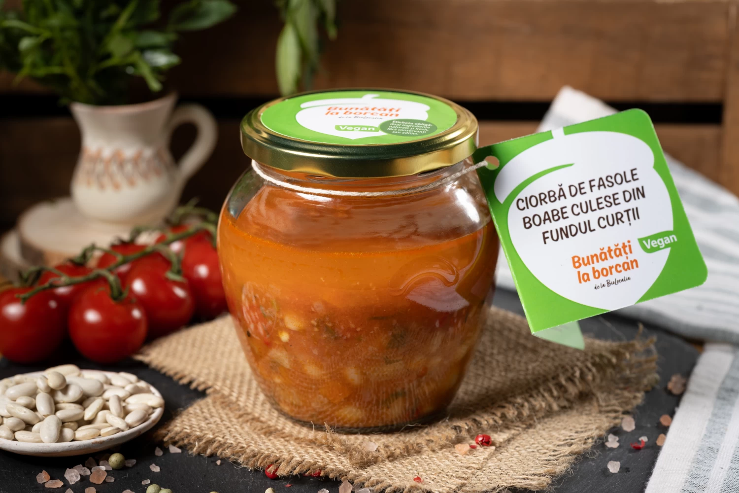
Healthy eating is essential for a balanced and happy life. BioLocalia only offers products that meet the highest quality and food safety standards. BioLocalia takes the raw material from small farmers and prepares a delicious food it packs in glass jars. Customers are invited to return the packaging. The system encourages local producers and builds trust between customers and producers.
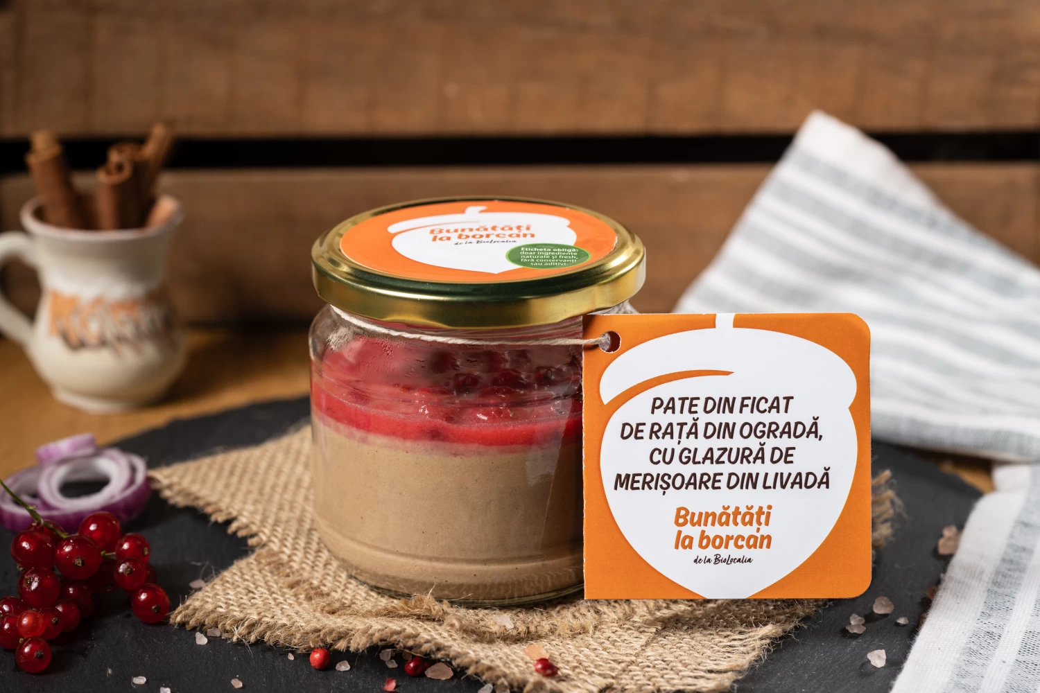
The products are rigorously selected. The products are 100% organic, without additives or artificial preservatives.
BioLocalia works directly with small farmers in the region, ensuring that they receive fair remuneration for their work and that the produce reaches consumers' tables fresh and healthy.
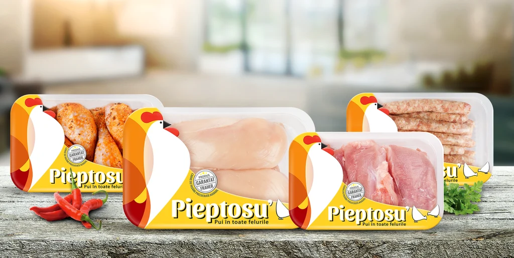
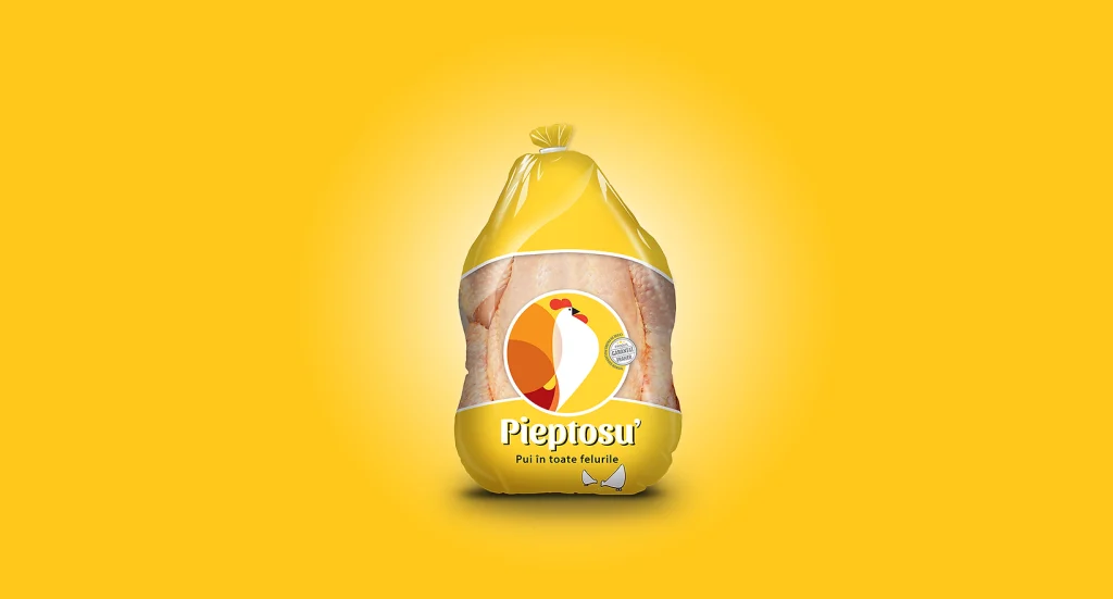
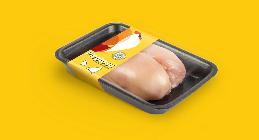
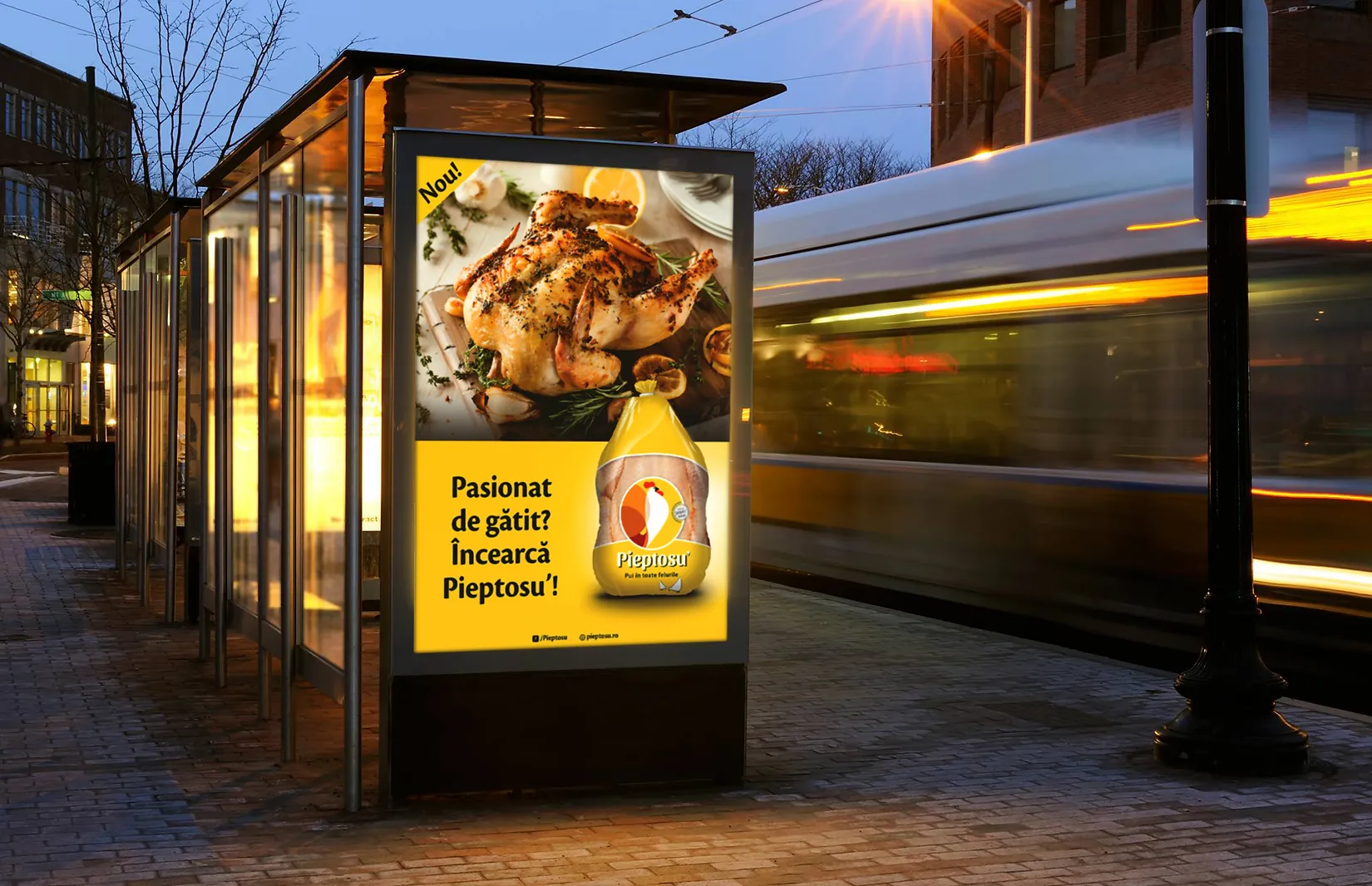
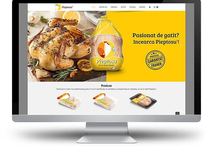
Fraher company continues its path towards a natural development and presents to the world the latest achievement: Pieptosu ’, a brand with a look as fresh as the products of its categories.
The image identity has a modern design that delights your eyes through a color range dominated by warm shades. Pieptosu ’uses, in addition to the humorous note of the brand name, a strategy focused on the consumer's needs.
The brand places its differentiating element in the choice to transform a necessity into a real pleasure, felt only by gastronomy enthusiasts.
In addition to the values of the Fraher company and the freshness already associated as the main attribute of its products, the adoption of the new identity speaks about the passion for cooking.
The communication mix of the new identity and the new packaging includes signaling through POSMs made in an innovative style that announces the diversity of products. The creation of the presentation site www.pieptosu.ro, online and social media communication, as well as promotion through - a radio spot in Tulcea county and local magazines.
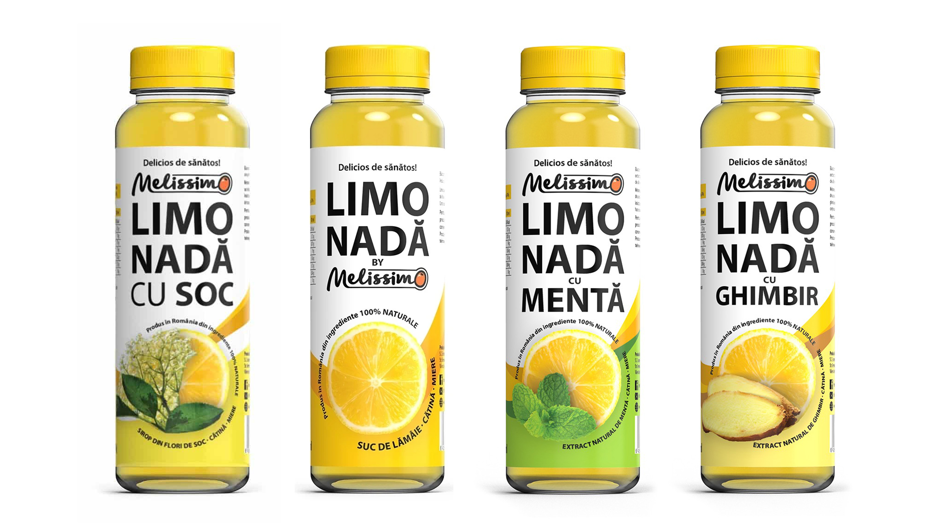
The Melissimo lemonade range is a 100% natural product. We created a visual identity for the range of natural juices with lemon and sea buckthorn.
Without artificial preservatives, colors, or flavors, Melissimo lemonade is a pure and honest product.
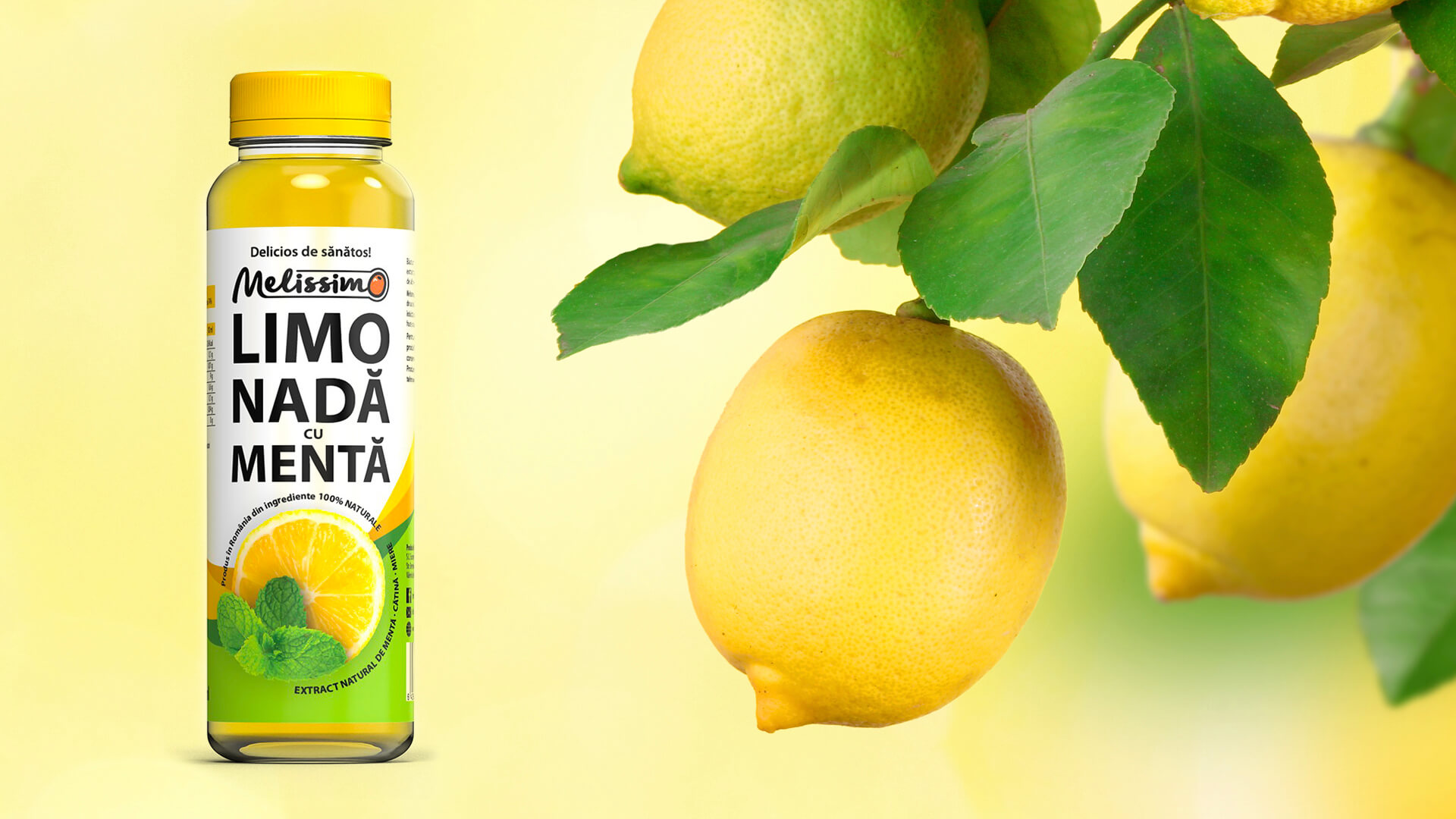
To convey this authenticity and freshness in a visual way, we created a design that emphasizes the natural color of the product. The bright and vibrant yellow of fresh lemons. In the center of the label, you will find the image of a ripe lemon, reminiscent of the rich aroma and refreshing taste offered by the juice.
Using a harmonious combination of shades of yellow and green, we created an attractive background that suggests the freshness and naturalness of lemonade. The fonts chosen are friendly and clean, complementing the overall look of the design and communicating a sense of quality and attention to detail.
The Melissimo brand has created a range of new products in its portfolio, lemonade with sea buckthorn, with mint, elderberry, and ginger. The design is simple and unified, highlighting the attractive colors of the product in the container. The Art Director chose to differentiate the products in the range by using appetizing photos of the ingredients. The design of the Melissimo natural lemonade range continues the sensory and colorful style started with the sea buckthorn juice project Agită-mă! See the project here.
Melissimo lemonade is sold both online and in the largest retail chains, such as Mega Image, Carrefour, Auchan, or OMV gas stations.
The aim of this project was to create a unified and distinct visual style for the range of juices. The naturalness of the product is communicated visually through the photos of the ingredients and by highlighting the intense color of the product.
How we started the Nixodor Branding Process. A whole lotta Beethovens, Lassies, and Aristocats, or the market context. The worldwide pet census recorded over 600 million cats and over 500 million dogs. Meaning registered pets, homed, loved, and cared for as a family. And obviously, people go out of their way to offer their fun and furry "children" the best, happiest, and healthiest life.
Much to the delight of our four-legged friends, in Romania and elsewhere, a pet-loving company recently launched NIXODOR. A dietary supplement that prevents the most common health problems - those of the digestive tract.
Mixed in the pets' regular food, NIXODOR helps boost immunity, maintain intestinal flora, improve the look of skin and fur, and - most importantly perhaps - has an instant effect in reducing the smell of "leftovers" we collect from parks, litterboxes or (ugh!!!) carpets.
Brand identity. NIXODOR is a natural dietary supplement recommended by veterinarians. So it has high credibility. Moreover, the product is created and manufactured in Austria, and our client wanted to pinpoint the Teutonic rigor and precision in the brand communication.
The verbal identity is descriptive, created by juxtaposing the particles "nix" (word meaning "zero, nothing", of Germanic origin, but currently spread worldwide) and "odor" (from the French "odeur" and the Anglo-American "odo(u)r", borrowed in Romanian from Latin and initially meaning "smell").
NIXODOR brand name highlights the product's special benefit - the absence of excrement unpleasant odor - transcending linguistic and cultural boundaries to address buyers in all markets.
Happy tails on the net. Promotion campaign. The NIXODOR logo visually conveys the medical, serious nature of the product. The lettering, simple and clear, express the supplement's lab-like precision. The thick-and-thin alternation of font styles shows the two components, decoding the brand name's meaning.
The usage of capital letters facilitates reading both horizontally and vertically so that the logo remains readable across various communication media.
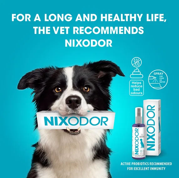
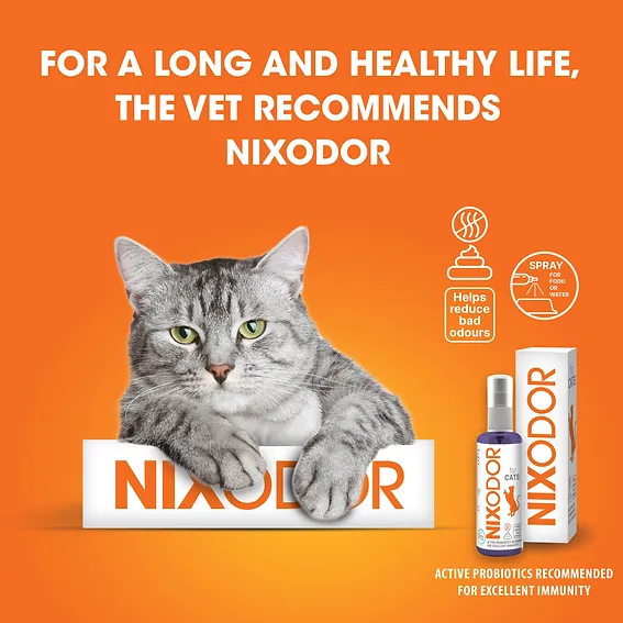
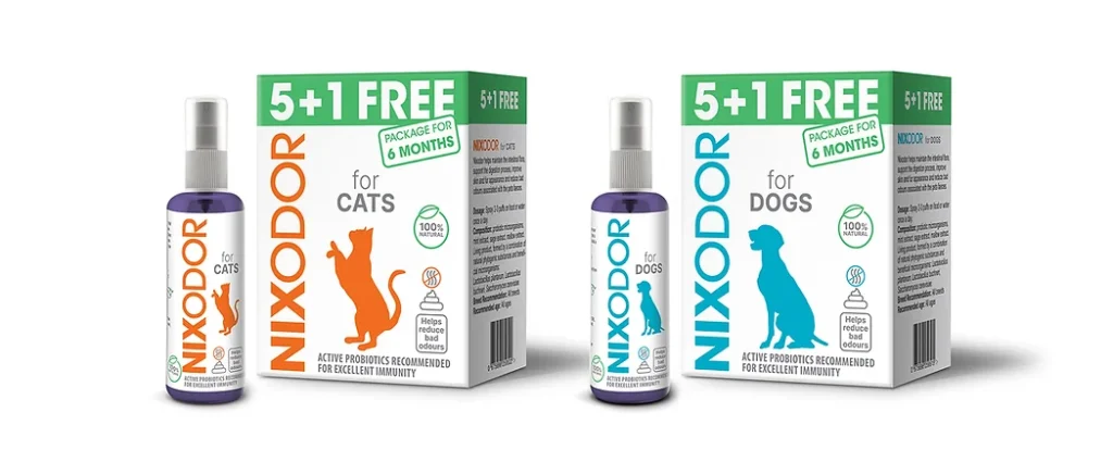
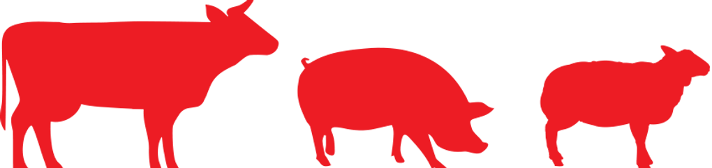
The packaging allows for quick cat vs dog product differentiation, both on shelves and online. Chromatically speaking, orange suggests playfulness, curiosity, energy, and grace specific to felines, while blue - canine loyalty and intelligence.
The figurative elements identify, once again, each product's furry consumer, while keeping brand rigor.
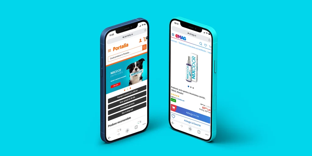
In addition to vet offices, NIXODOR is sold online, on eMag in Romania, and on Amazon internationally. Therefore, the launch and promotion campaigns are deployed mainly online, featuring colorful visuals, meows, woofs, and a whole lotta fun, with zero unwanted odors.
And if Didona, the Logo Bigger agency doggie, will ever get to Tik Tok, she'll surely upload a five-star video review for NIXODOR, and we'll gladly back her up. Have a woofy day!
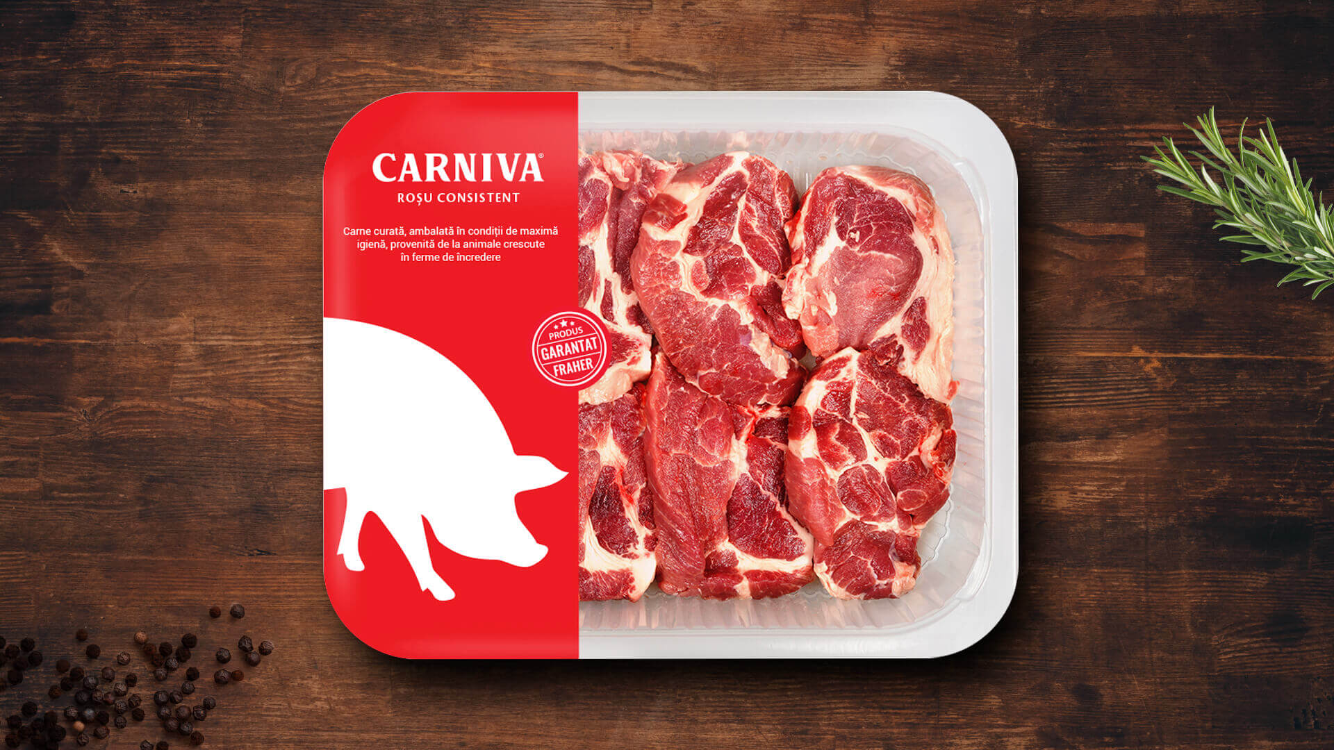
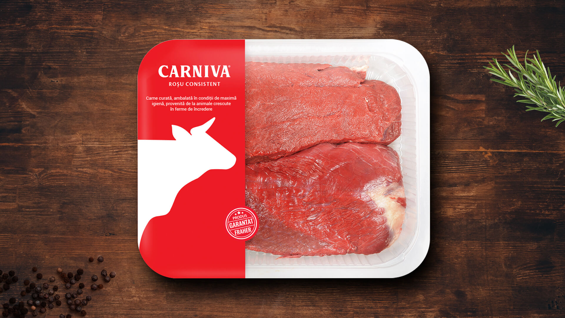
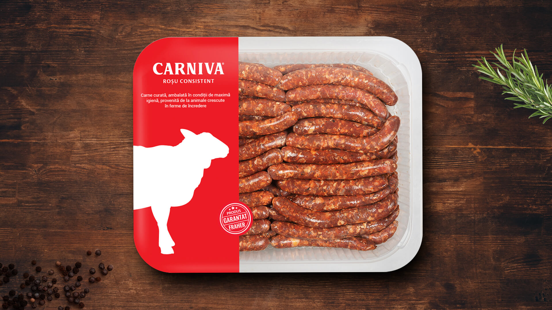
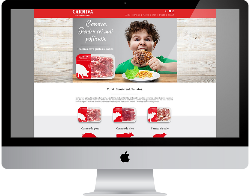
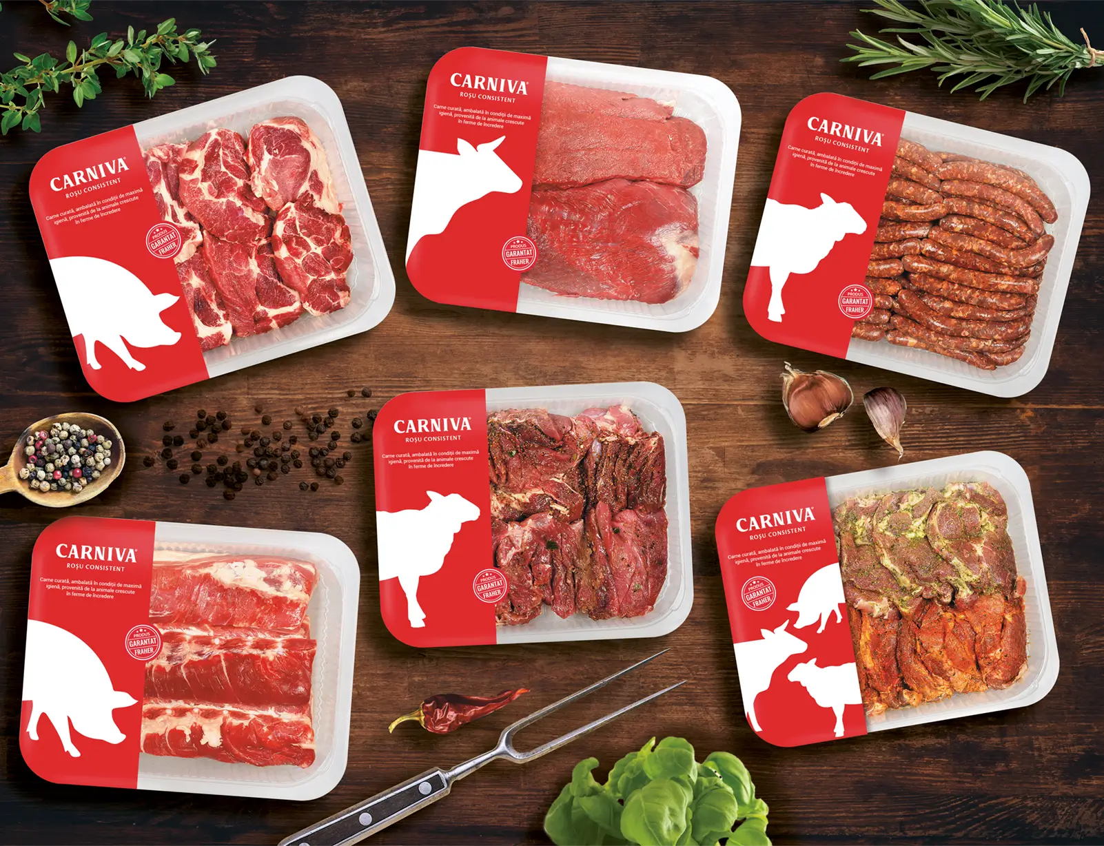
Branding Carniva. Consistent Branding
In general, the food category is very competitive. But the subcategory of red meats is almost invisible. Our client identified this not sufficiently exploited niche and built a brand dedicated to this category. A smart move because a unitary and coherent brand helps you both to position yourself correctly and to gain the consumer's trust.
As with any new brand, it all started with a discussion with the customer. He told us everything about the business, the target audience, and what he wanted from the new brand. Once we understood everything we had to do, we moved on to strategy. Because isn't it, any well-known brand has a solid foundation behind it.
But that didn't come overnight. We started with an analysis of the competition.
Who sells red meat in Romania? Supermarkets have their own brands and sometimes even their own butchers, small local producers, and so on. It seemed that the territory was quite free. So, together with the office, we toured the stores to see exactly how the situation is in the field.
The final verdict? Not too well. As I said, the market is not consistent and this is clear when you are in front of the window. No manufacturer can boast a branding that attracts your attention or a unitary communication. The packaging also seemed to be left somewhere in the background.
The first step in exceeding your customers’ expectations is to know those expectations.
Roy H. Williams
Then we thought about the consumer. What does he appreciate when it comes to meat? First of all, the traditional butchery. For those who have access to fresh meat, chilled meats are much less attractive. After all, it's normal because you know exactly what you're buying. What you see is what you get.
Instead, those who do not have time to shop or have no butcher shop nearby, prefer to buy their meat in a casserole. Not because they like it, but because they have no choice. This is how I came to the conclusion that the average person would appreciate a brand that promises a healthy and clean product.
Another part of the strategy was the slogan. Fraher needed a short but memorable slogan. Something to focus the essence of the brand and pass it on to the consumer. So we thought about the properties of meat. Why do people buy meat? Why consume it? What do you look at the first time you buy a meat casserole?
The answer lies in color. And in consistency, but more in color. The meat is bought because it is nutritious, but the final decision is influenced by color, from intense red to pink, depending on the type of meat. And so the slogan was born - Consistent Red. Thus, the consumer understood that Fraher put on the market clean, healthy and, above all, consistent products.
On the principle of less is more, we chose a strong but very simple font, clean and easy to read.
"Yes, it's bold and simple, but there's another little detail that I liked about this font - some edges of the letters look exactly like a butcher's knife. If you look closely at the R or the V, you'll see exactly what I mean. " Matei Arnautu, Head of Art
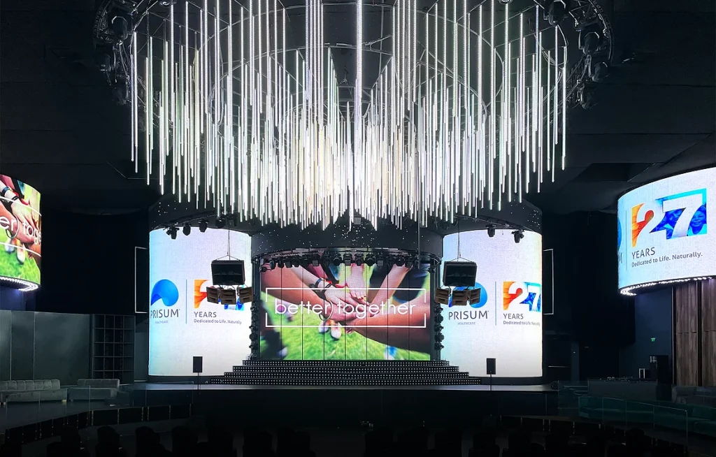
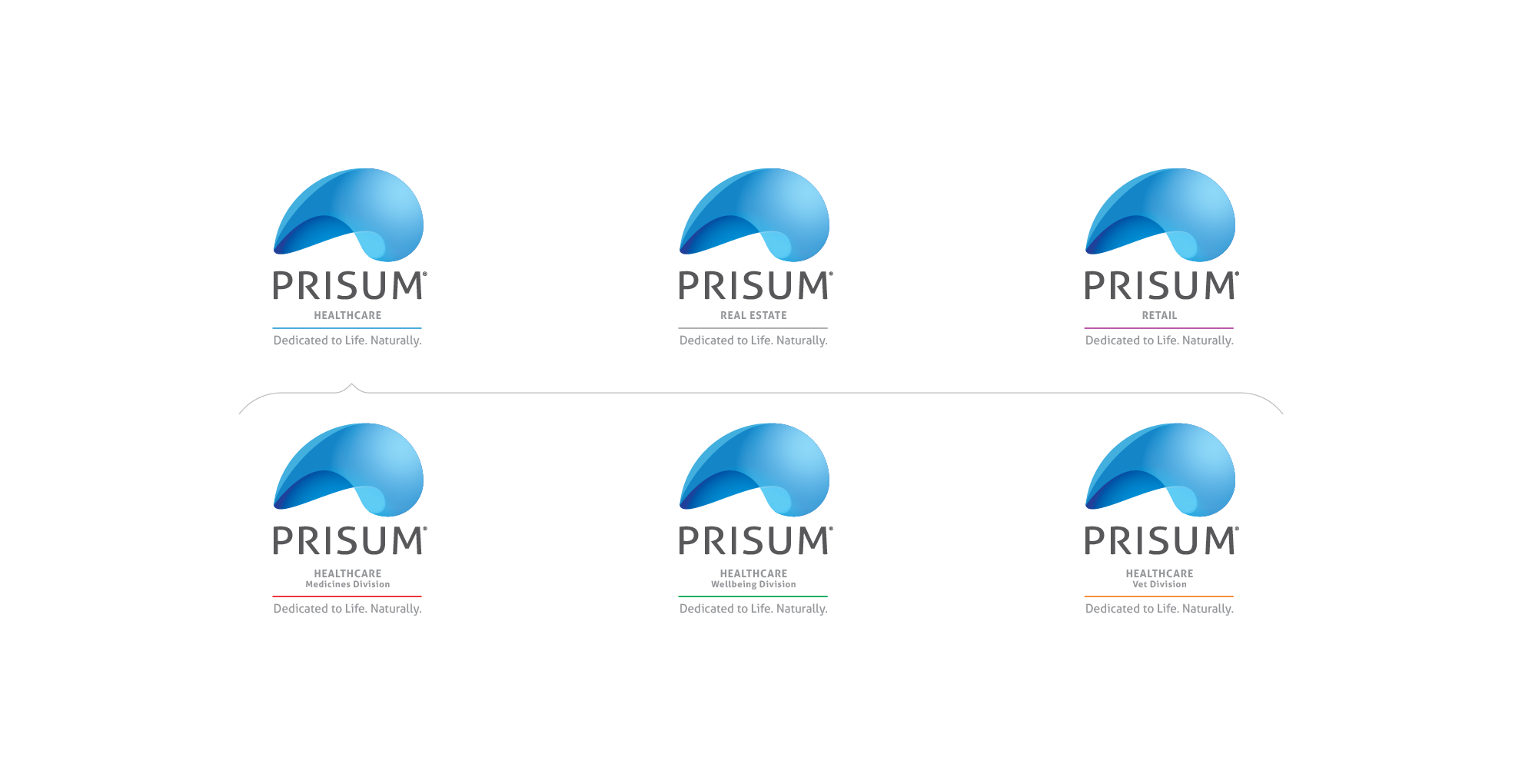
Founded in 1994, Prisum is a pharma company like not many. At the heart of Prisum's business model are the humans. Humans, with their perfect imperfections, with their ideals and meanings.
Prisum needed a new visual identity. An identity that would better reflect the values they believed in. From the logo, slogan, brand book, stationery design, and to the redecoration of the headquarters, we were with Prisum in this journey.
We started by talking to the company's employees. We understand that Prisum is dedicated to people. That it respects nature, in all its forms. That they are dedicated to life, naturally. They spoke enthusiastically about their concern for human health and the importance of plants in the composition of products.
And we understood how important it is for a visual identity to naturally reflect a company's values. Thus, it naturally acquired a double meaning: the composition of the distributed products but also that of a natural, natural preoccupation - care for people. And so the slogan was born: Dedicated to life. Naturally.
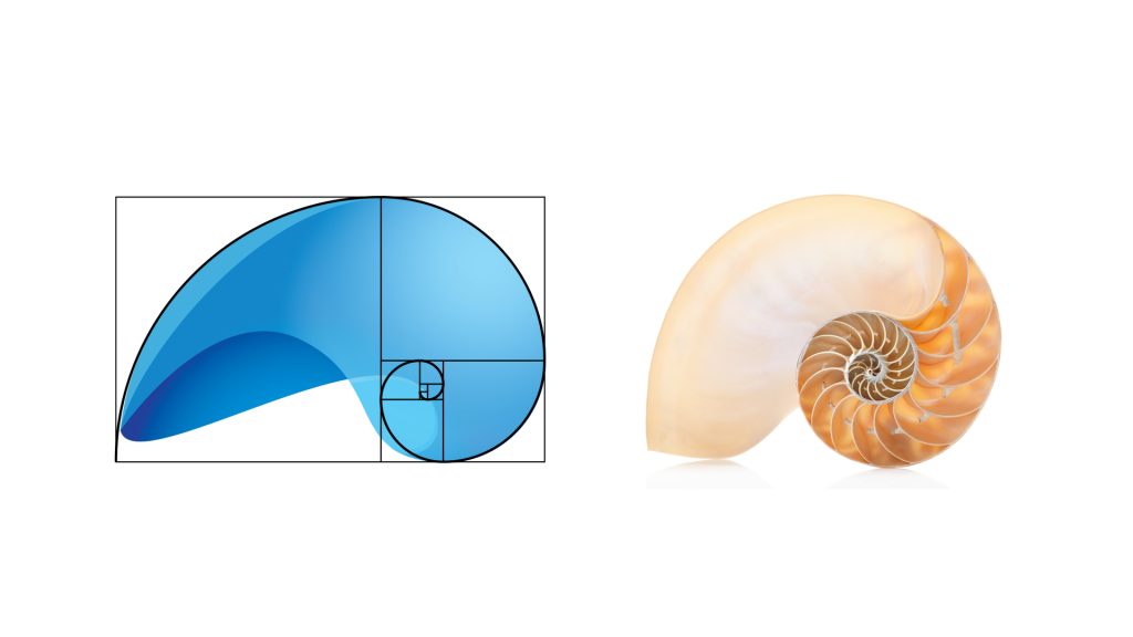
The Fibonacci sequence inspired both the concept and the logo itself. The golden ratio appears everywhere in nature - from the arrangement of the leaves, from the petals of a flower to the phalanges of the human hand. The golden ratio shows us how meticulous and careful nature is throughout its creative process. The perfect geometry of nature was our source of inspiration.
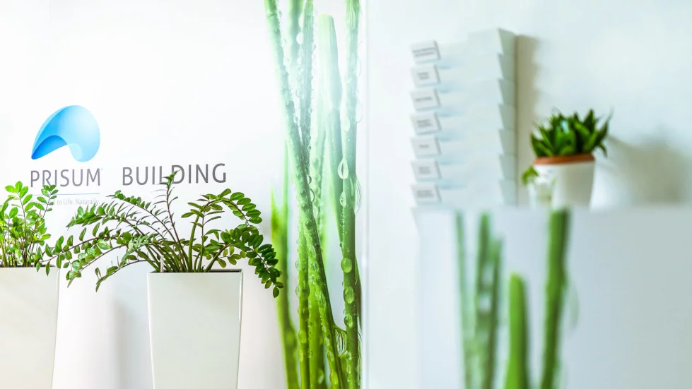
It was a project we worked on with pleasure, knowing that everything started from people, from the desire to offer them a beautiful space in which to spend their 8 hours working. By rebranding the headquarters, Prisum has established a corporate identity that matches their set of values - Courage, Passion, Inspiration.
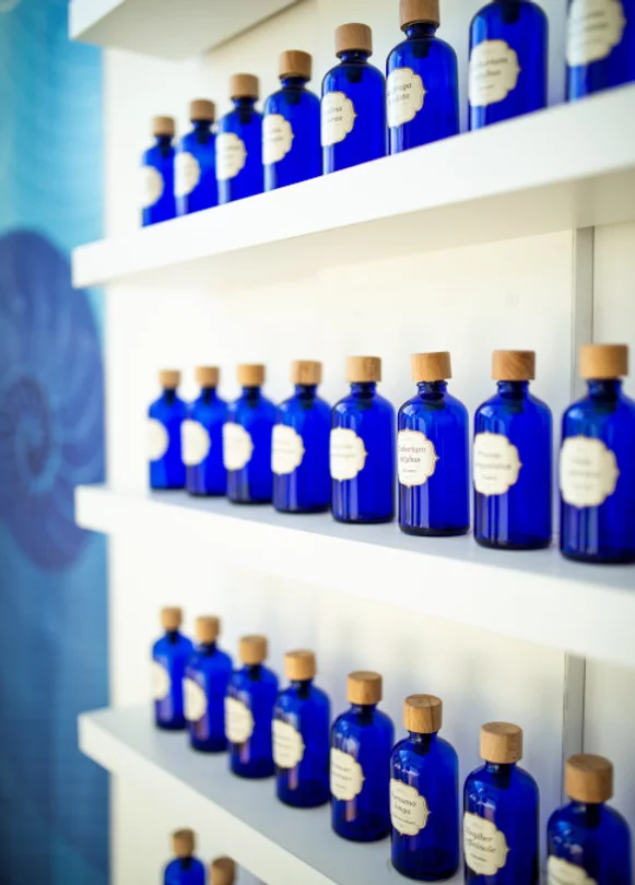
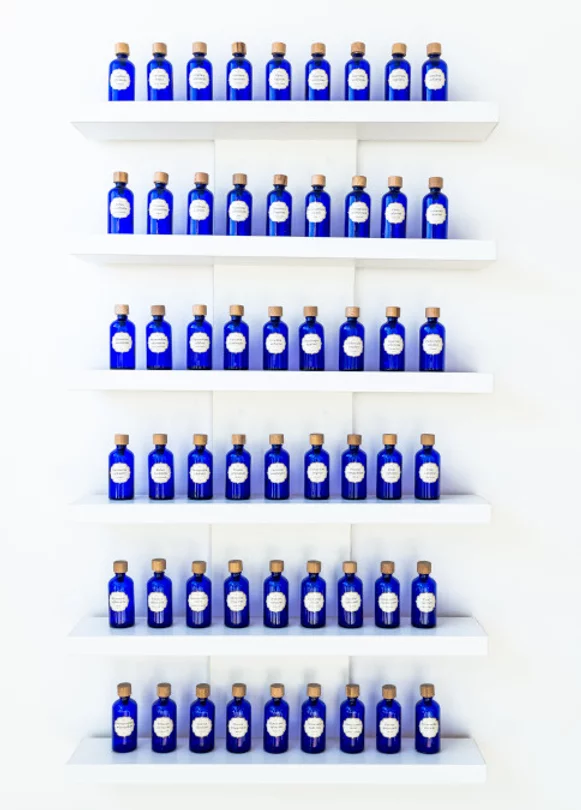
We used a set of colors to express the idea of pharma, but to maintain a cheerful note at the same time: blue, green and white. Purity, freshness, health. We also added some greenery to the mix because, after all, what is a venue with natural motifs without some adorable seedlings in the decor? Plus we learned that hydrangeas are not houseplants. (:
The crane panel is one of many social projects that will be displayed in the new Prisum office. Origami cranes are made by Romanian artist Cristian Marianciuc who, in 2015, started an ambitious project - one origami crane a day, every day of the year.
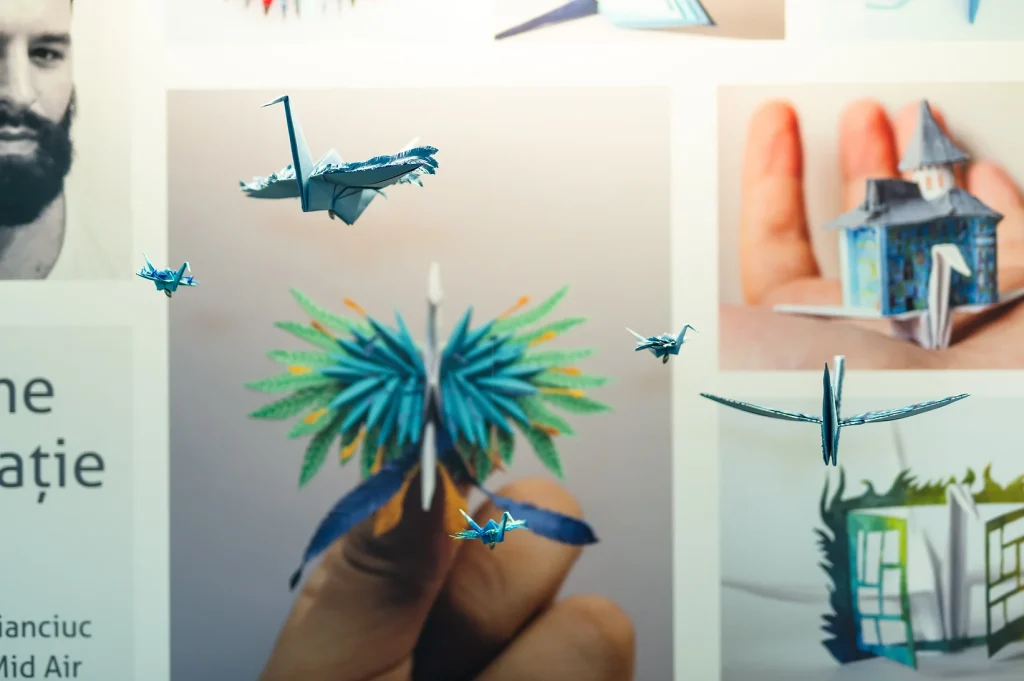
We worked with the photographer Matei Buta, to capture the cranes in the smallest detail. The Prisum headquarters thus received a corner where the beautiful photos combine with the little roosters that seem to fly in the sunlight. The project is meant to inspire and amaze. Whoever steps in the headquarters, is encouraged to do something good for the world, for people or even for himself.
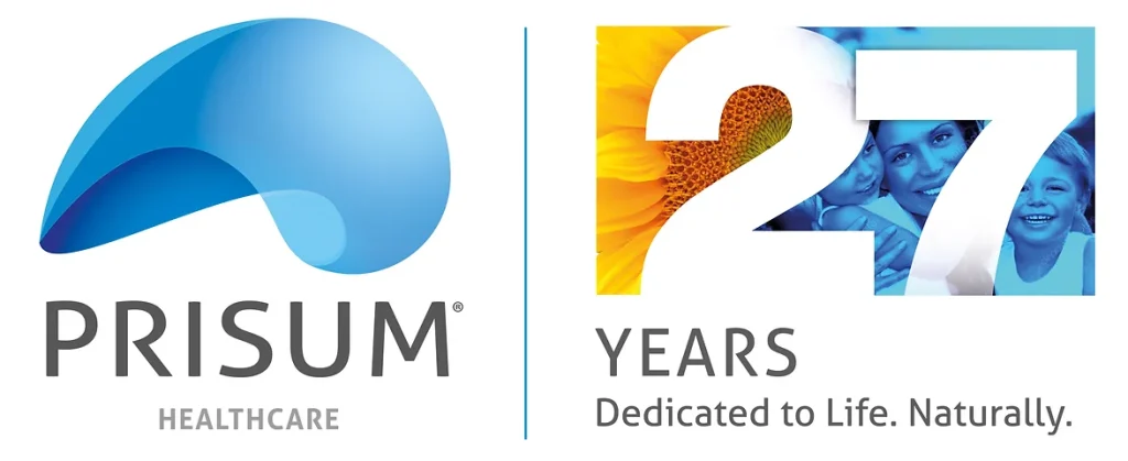
We created the 27th anniversary logo dedicated to life. We communicate Prisum's concern for humans and nature. The logo has been declined in various video or printed materials.