We created the name, logo and packaging design for a new veterinary product. Dr. Poop helps pets have healthy digestion and better immunity. The name and visual identity communicates the product's benefits and appeals to cat and puppy lovers.
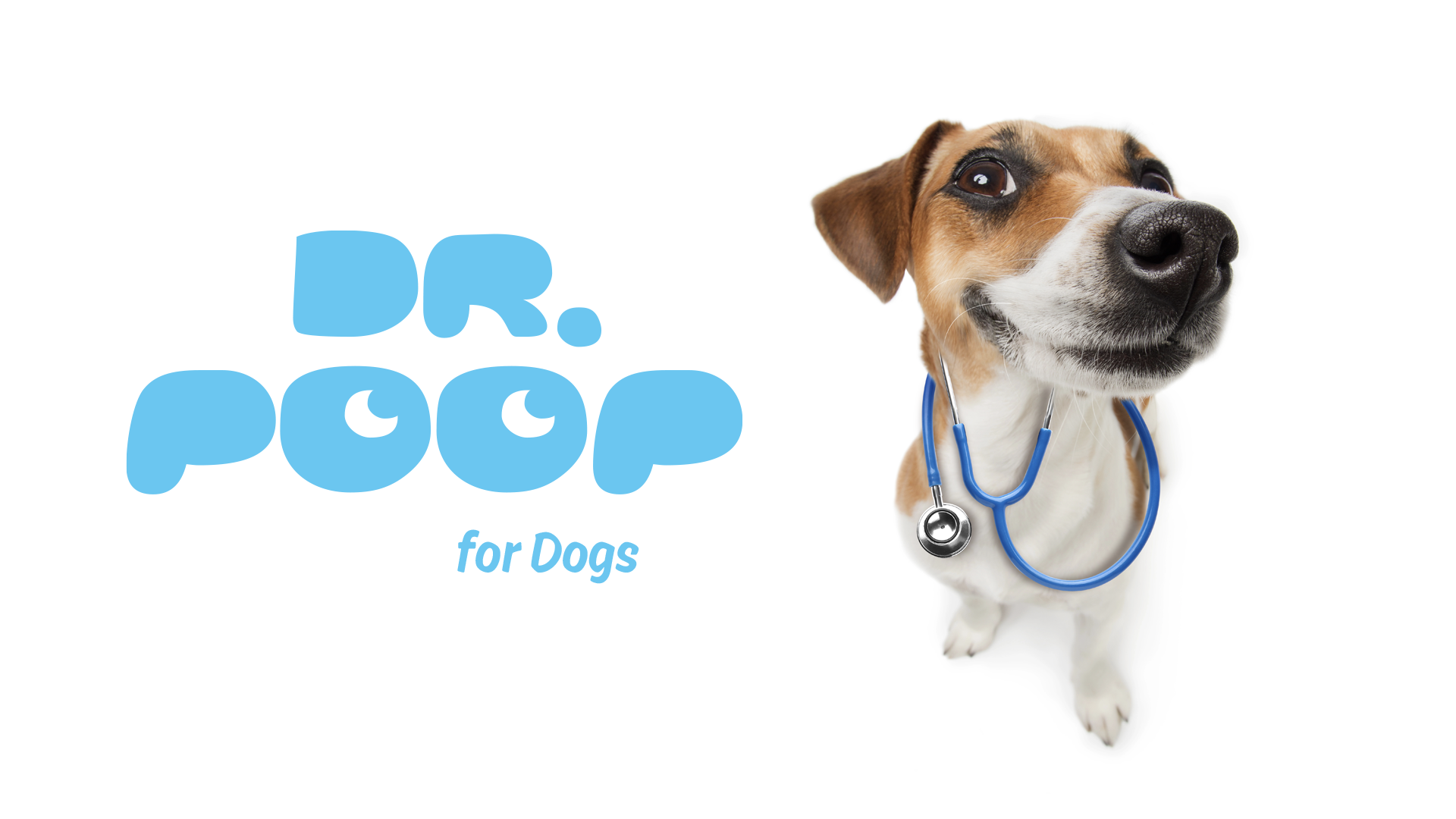
The logo is playful and cheerful. I used the two letters "O" to draw two eyes looking to the right. The letters "P" can be seen as the character's ears.
The new brand is built on the idea of authority / expert, using the particle "doctor", where "Poop" is the area of expertise, of product action. The name has the advantage of quickly expressing what the product range does: it takes care of the animal's digestion & excretion scientifically.
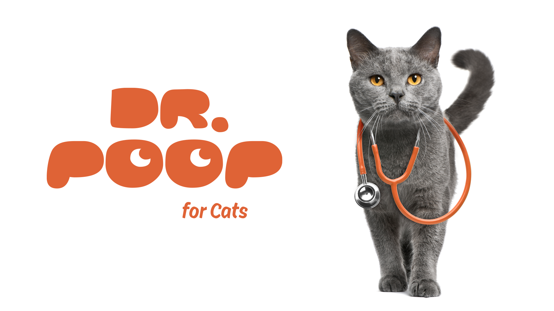
The cat and the puppy with the stethoscope complete the brand's visual identity. Pets know best what they need and offer advice to those interested. I wanted the images to be funny and full of energy, just like the healthy and happy pets.
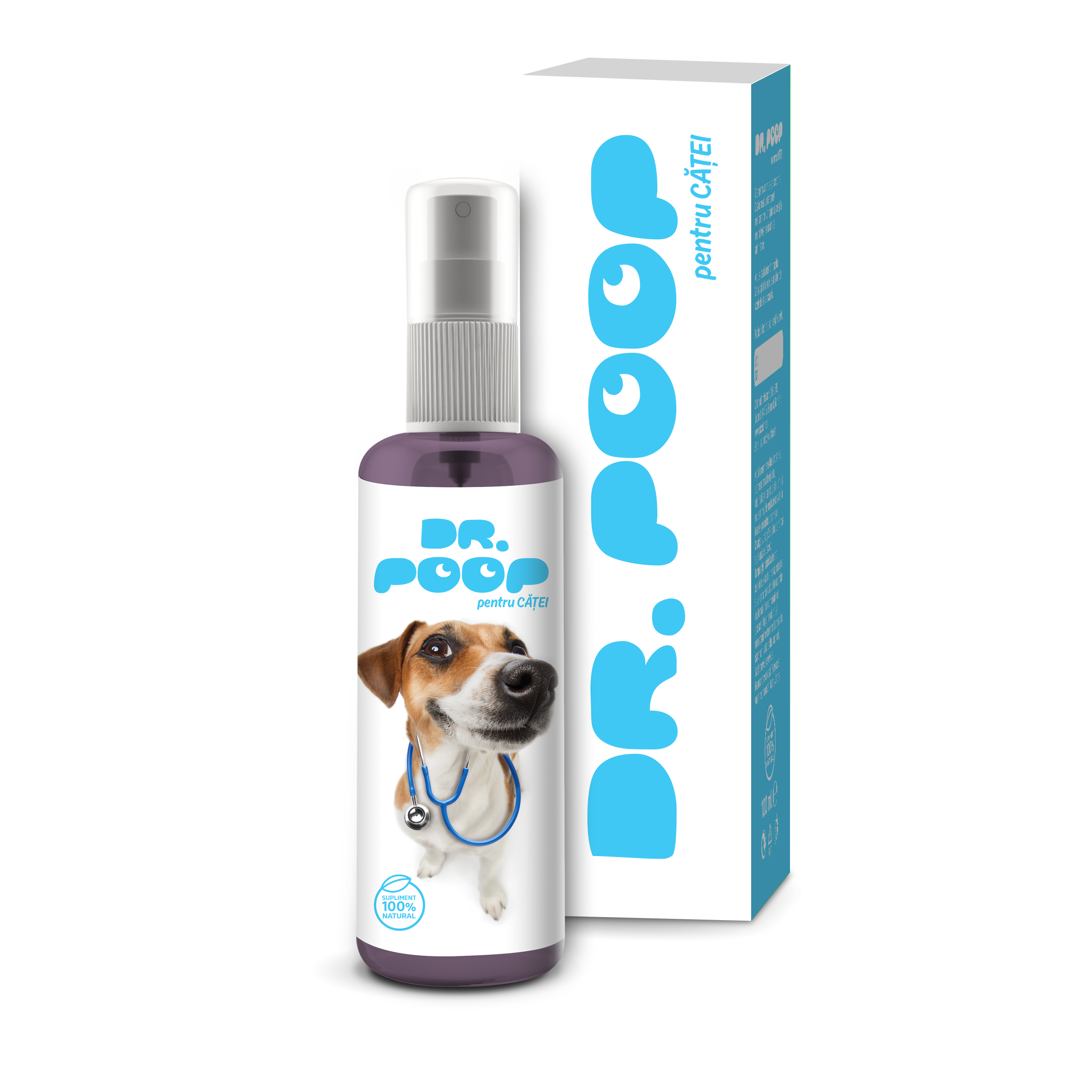
The packaging is simple and clean, the way a puppy owner wants their yard or home to be. We used color differentiation, blue for Dr. Poop for puppies and orange for Dr. Poop for cats to help pet owners quickly identify the different product ranges.
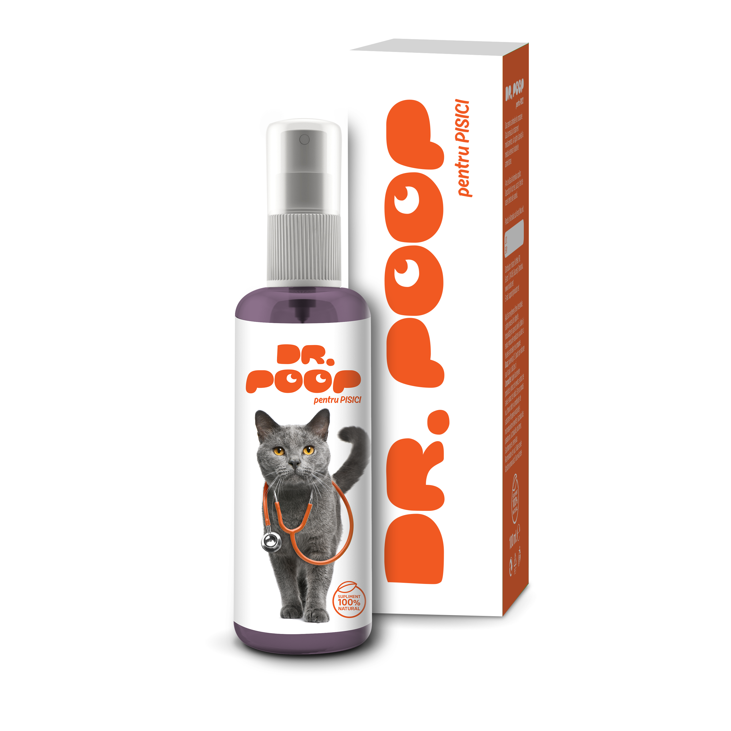
The cat with the stethoscope is an original and memorable image that helps us communicate the benefits of the product and associate the brand with authority in the veterinary field.