The Melissimo lemonade range is a 100% natural product. We created a visual identity for the range of natural juices with lemon and sea buckthorn.

Without artificial preservatives, colors, or flavors, Melissimo lemonade is a pure and honest product.
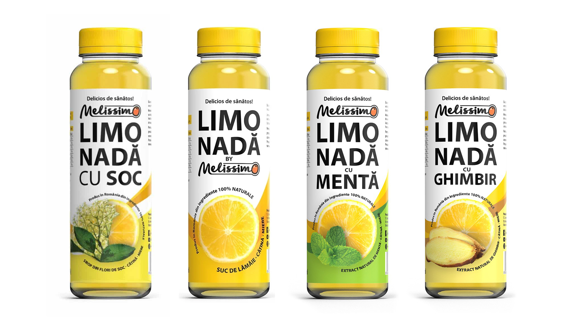
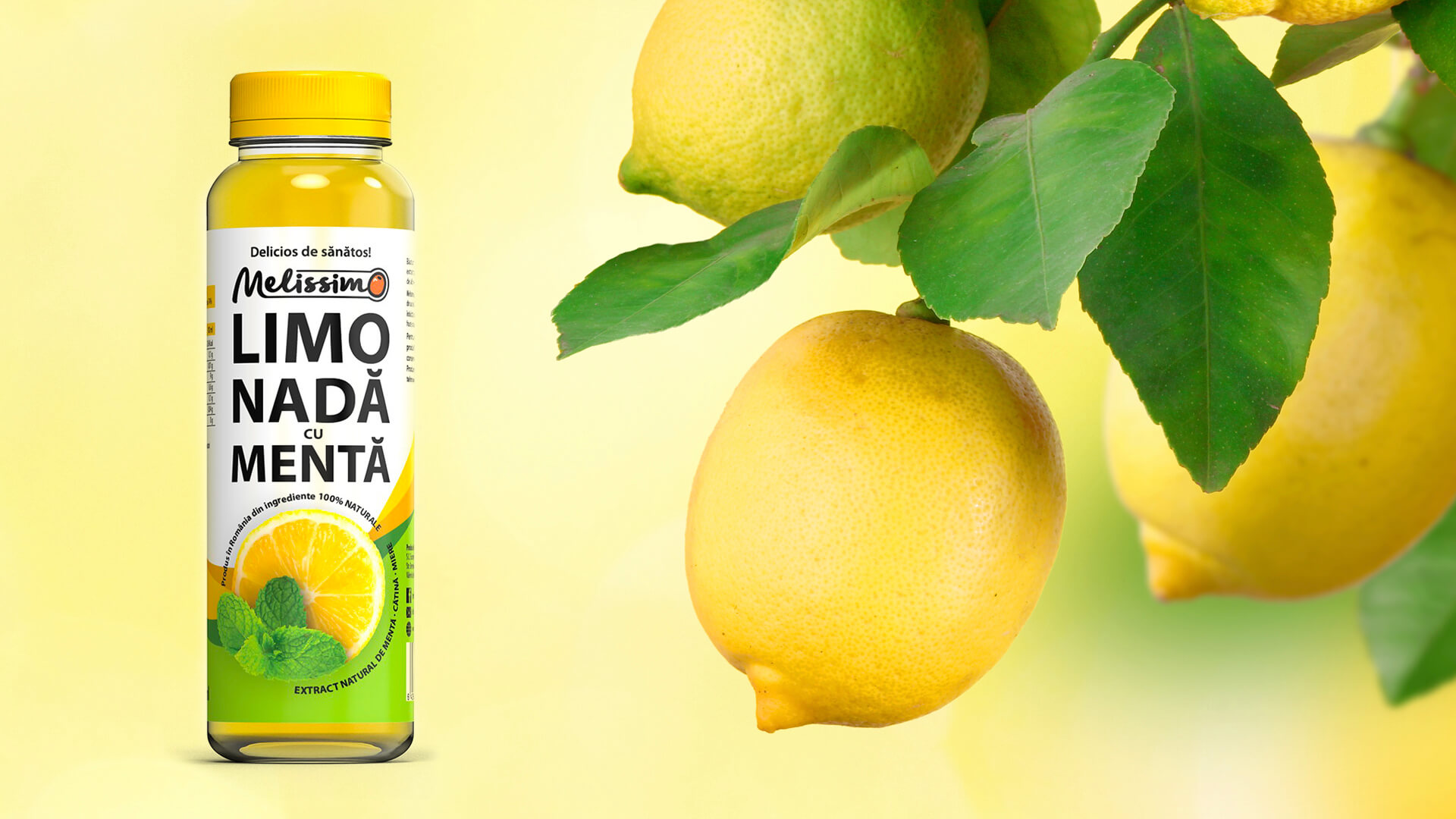
To convey this authenticity and freshness in a visual way, we created a design that emphasizes the natural color of the product. The bright and vibrant yellow of fresh lemons. In the center of the label, you will find the image of a ripe lemon, reminiscent of the rich aroma and refreshing taste offered by the juice.
Using a harmonious combination of shades of yellow and green, we created an attractive background that suggests the freshness and naturalness of lemonade. The fonts chosen are friendly and clean, complementing the overall look of the design and communicating a sense of quality and attention to detail.
The Melissimo brand has created a range of new products in its portfolio, lemonade with sea buckthorn, with mint, elderberry, and ginger. The design is simple and unified, highlighting the attractive colors of the product in the container. The Art Director chose to differentiate the products in the range by using appetizing photos of the ingredients. The design of the Melissimo natural lemonade range continues the sensory and colorful style started with the sea buckthorn juice project Agită-mă! See the project here.

Melissimo lemonade is sold both online and in the largest retail chains, such as Mega Image, Carrefour, Auchan, or OMV gas stations.
The aim of this project was to create a unified and distinct visual style for the range of juices. The naturalness of the product is communicated visually through the photos of the ingredients and by highlighting the intense color of the product.