The degreaser category is highly functional and saturated with cluttered packaging, heavy technical language, and aggressively phrased promises. For users, identifying real differences between products becomes difficult, while trust is increasingly hard to earn. In this context, NIXODOR Degreaser required an identity capable of communicating immediate efficiency, control, and clarity—both on the shelf and during use—without confusion or exaggerated claims.
From a verbal standpoint, the challenge was the absence of a coherent, result-oriented narrative that could be quickly understood by both professional users and home consumers. Visually, the category often suffers from information overload and weak hierarchies, which slow down decision-making and reduce impact.

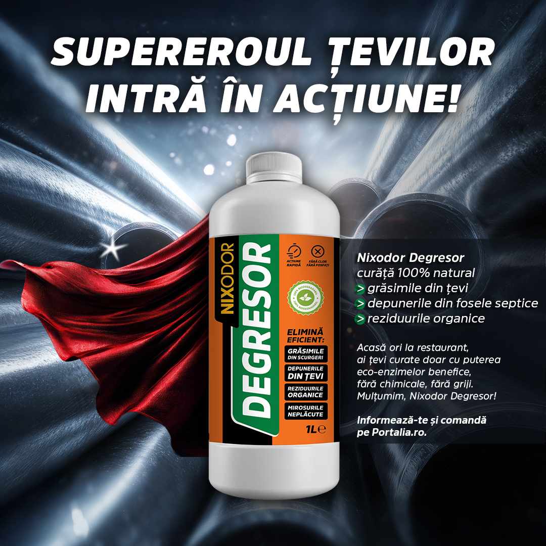
NIXODOR Degreaser’s verbal identity was developed around direct, firm, and action-driven language. Messaging relies on clear, functional verbs—“eliminates,” “degreases,” “acts fast”—to communicate the product’s core benefit instantly. The tone is pragmatic and precise, avoiding unnecessary metaphors and ambiguity, reinforcing the product’s positioning as efficient, reliable, and controlled.
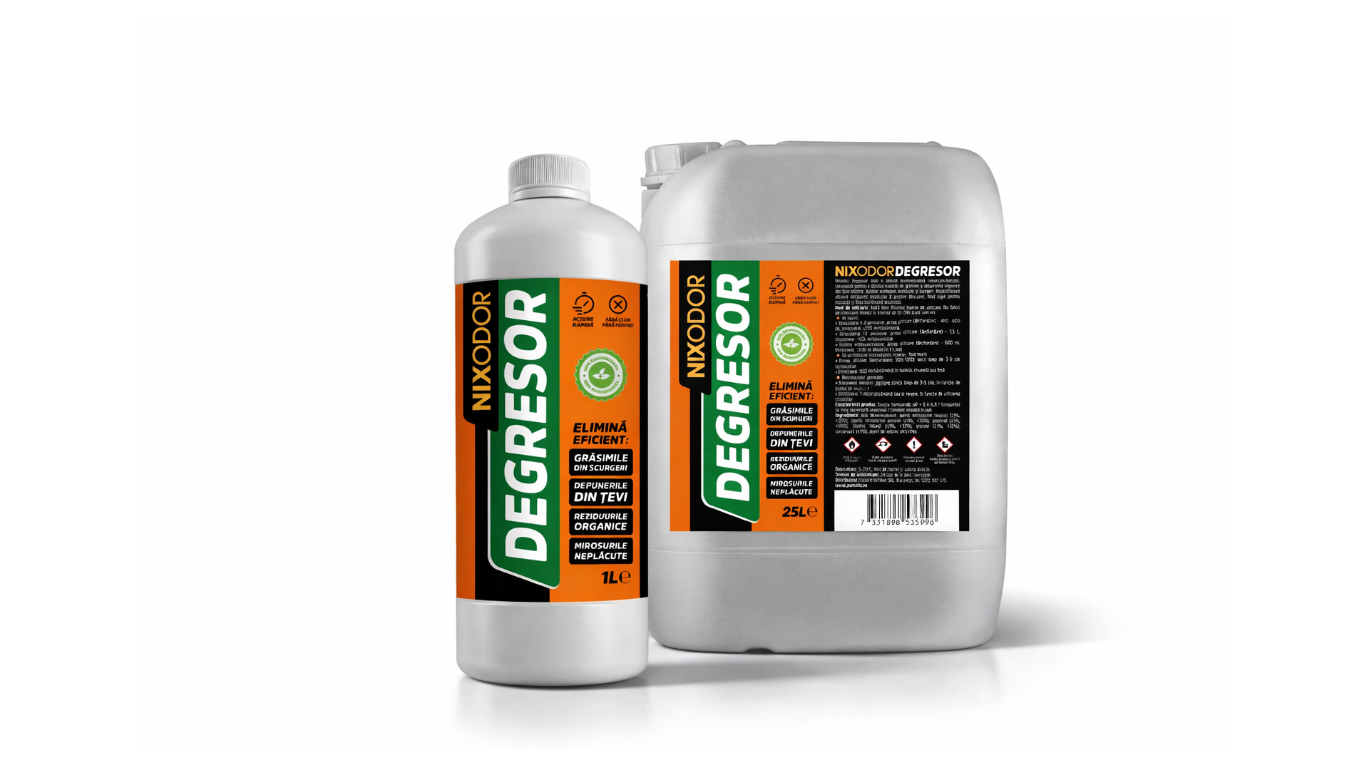
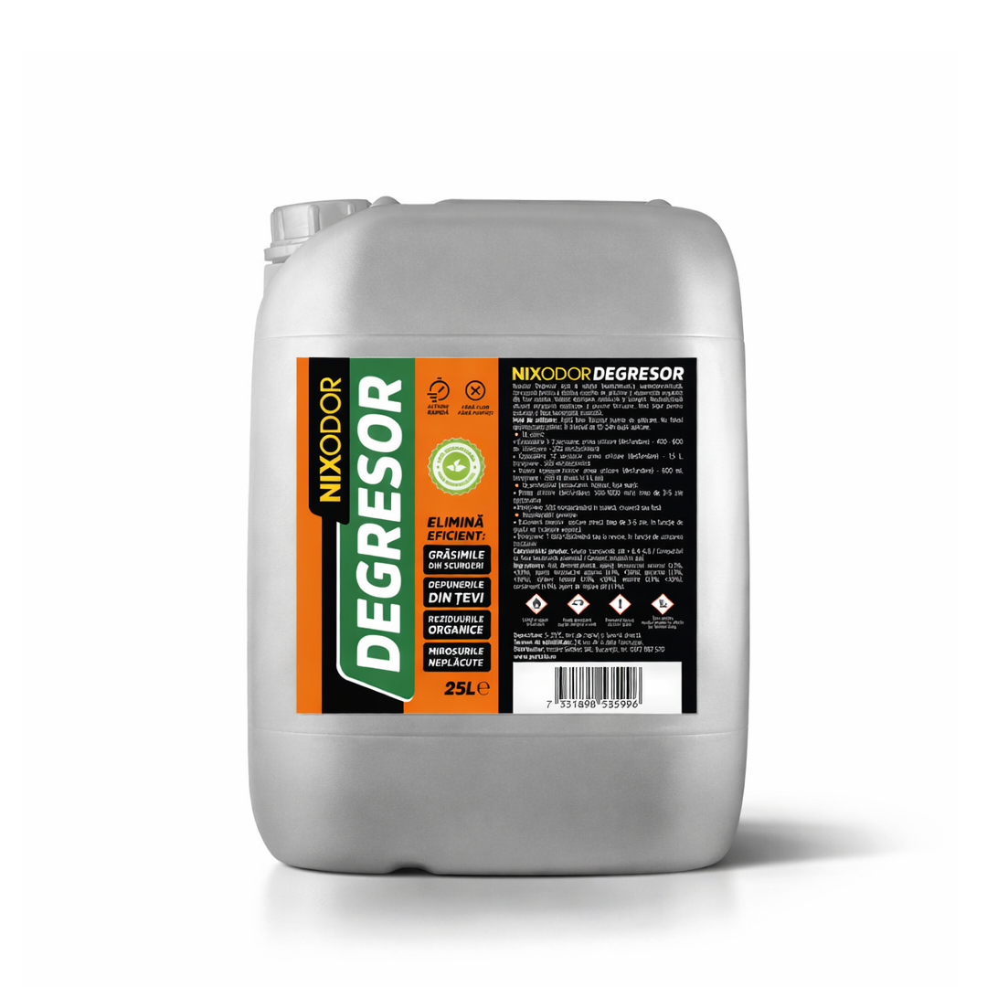
The visual identity follows the same logic. The graphic system is built on strong contrasts and a strictly defined visual hierarchy. Green conveys efficiency and control, orange signals action and energy, while black adds authority and seriousness. These color choices ensure fast recognition in retail environments and strong visibility in professional contexts.
Typography is robust, legible, and designed for functional clarity. The product name—DEGREASER—is treated as the primary visual anchor, immediately readable from a distance. Secondary information is structured in clear, modular blocks, allowing quick scanning without visual fatigue. Icons and symbols are used selectively, only where they accelerate understanding.
The result is a coherent, efficient verbal and visual identity tailored to a category where decisions are fast and performance-driven. NIXODOR Degreaser positions itself as a powerful, controlled, and easy-to-understand product, suitable for both retail and professional use.
The identity supports instant recognition, clear differentiation, and future range expansion, providing the brand with a solid platform for long-term growth. For LogoBigger, this project stands as an example of applied branding, where strategy, design, and functionality work together to support real-world performance.