Founded in 1994, Prisum is a pharma company like not many. At the heart of Prisum's business model are the humans. Humans, with their perfect imperfections, with their ideals and meanings.
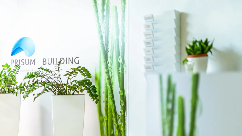
Prisum needed a new visual identity. An identity that would better reflect the values they believed in. From the logo, slogan, brand book, stationery design, and to the redecoration of the headquarters, we were with Prisum in this journey.
We started by talking to the company's employees. We understand that Prisum is dedicated to people. That it respects nature, in all its forms. That they are dedicated to life, naturally. They spoke enthusiastically about their concern for human health and the importance of plants in the composition of products.
And we understood how important it is for a visual identity to naturally reflect a company's values. Thus, it naturally acquired a double meaning: the composition of the distributed products but also that of a natural, natural preoccupation - care for people. And so the slogan was born: Dedicated to life. Naturally.
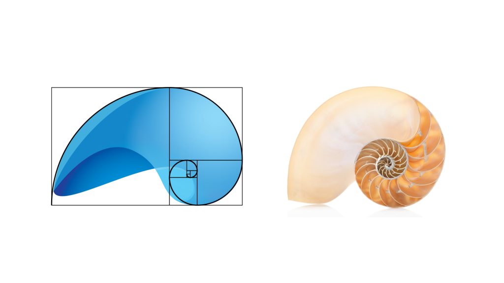
The Fibonacci sequence inspired both the concept and the logo itself. The golden ratio appears everywhere in nature - from the arrangement of the leaves, from the petals of a flower to the phalanges of the human hand. The golden ratio shows us how meticulous and careful nature is throughout its creative process. The perfect geometry of nature was our source of inspiration.
It was a project we worked on with pleasure, knowing that everything started from people, from the desire to offer them a beautiful space in which to spend their 8 hours working. By rebranding the headquarters, Prisum has established a corporate identity that matches their set of values - Courage, Passion, Inspiration.
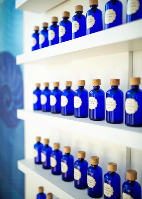
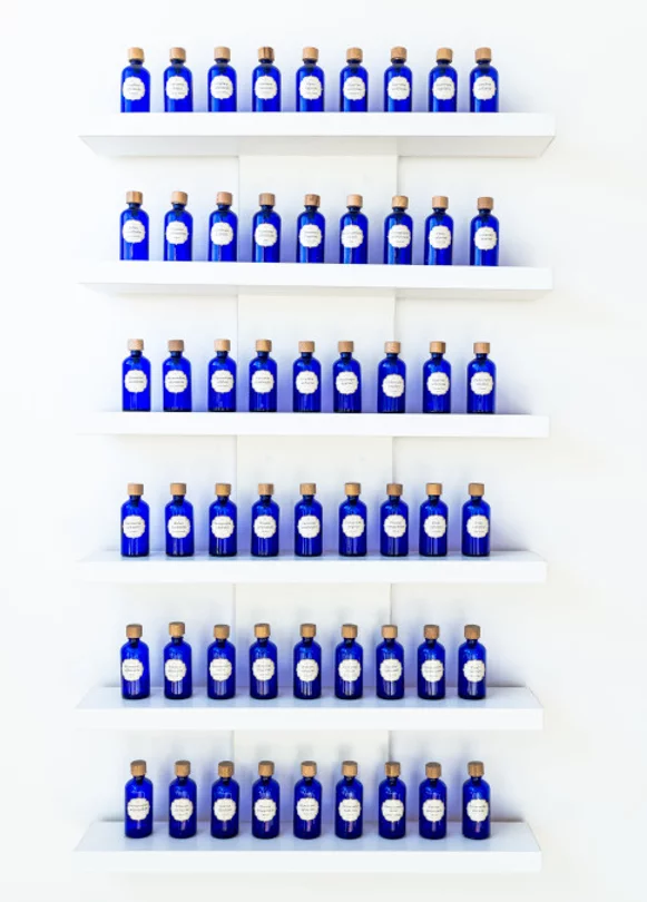
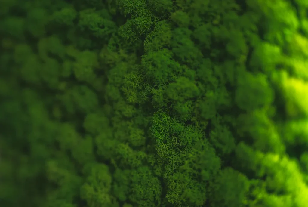
We used a set of colors to express the idea of pharma, but to maintain a cheerful note at the same time: blue, green and white. Purity, freshness, health. We also added some greenery to the mix because, after all, what is a venue with natural motifs without some adorable seedlings in the decor? Plus we learned that hydrangeas are not houseplants. (:
The crane panel is one of many social projects that will be displayed in the new Prisum office. Origami cranes are made by Romanian artist Cristian Marianciuc who, in 2015, started an ambitious project - one origami crane a day, every day of the year.
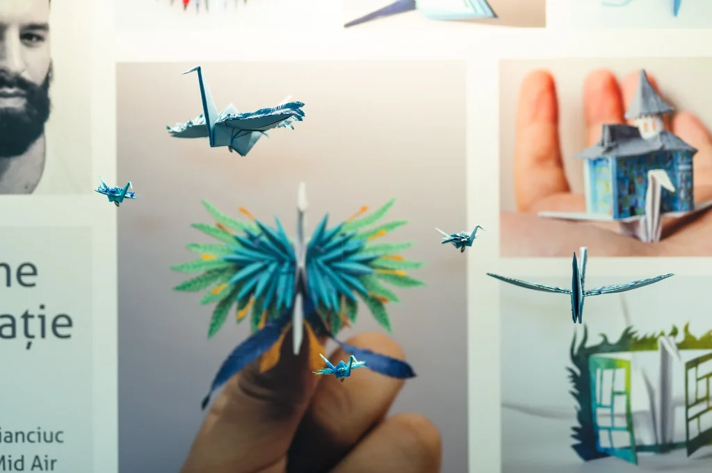
We worked with the photographer Matei Buta, to capture the cranes in the smallest detail. The Prisum headquarters thus received a corner where the beautiful photos combine with the little roosters that seem to fly in the sunlight. The project is meant to inspire and amaze. Whoever steps in the headquarters, is encouraged to do something good for the world, for people or even for himself.
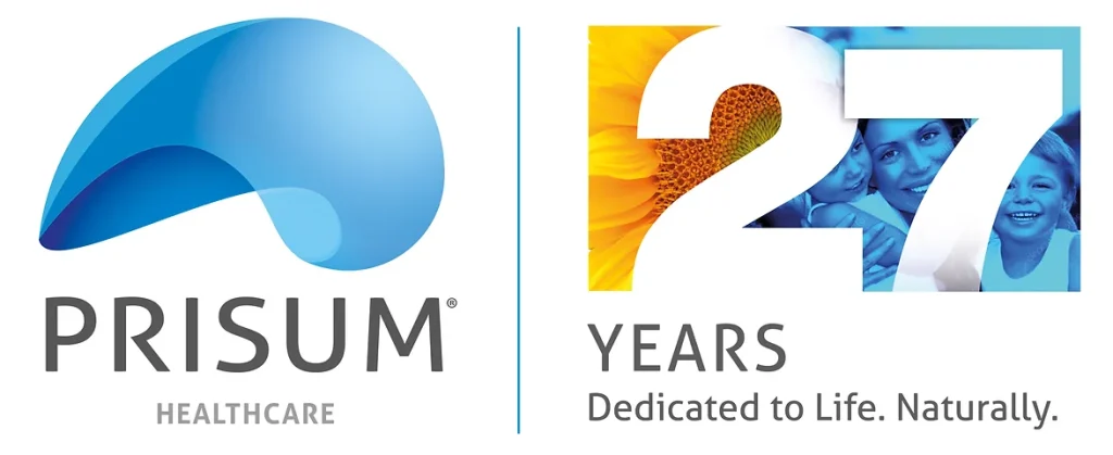
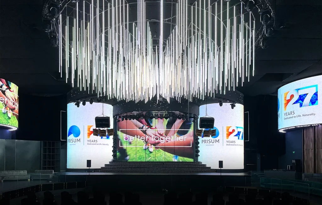
We created the 27th anniversary logo dedicated to life. We communicate Prisum's concern for humans and nature. The logo has been declined in various video or printed materials.