Access to safe drinking water is a constant concern for urban households. Although tap water is treated, its taste, smell, residual impurities, or a general lack of trust in infrastructure often lead consumers to look for alternative solutions. The market, however, is crowded with products that rely on overly technical language, hard-to-decode promises, and cold, industrial aesthetics, creating confusion rather than confidence.
For PurApa, we built a clear, calm, and accessible brand identity that translates a technical process into an easy, everyday experience. The verbal identity uses a reassuring, honest, and explanatory tone, focusing on real-life benefits: cleaner water, better taste, and safety for the whole family. The language avoids unnecessary jargon and explains simply what the product does and why it matters.
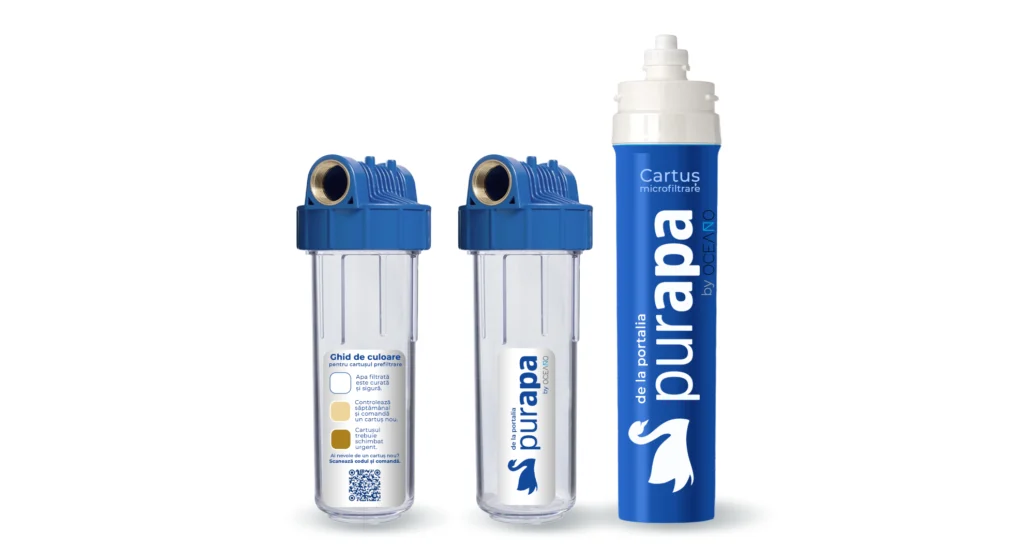
The visual identity is built around the ideas of purity, trust, and control. A blue-dominant color palette conveys freshness and reliability, while the swan symbol suggests cleanliness, balance, and natural harmony. The logo and graphic system are simple, airy, and memorable, supporting consistent communication across packaging, informational materials, and digital channels.