Zenda is an online sports equipment brand dedicated to people who want to bring clarity, balance and movement into their everyday routine. Built around the practice of yoga, the brand offers high-quality essentials — from mats to accessories — created to support a focused practice, a stronger body and a calmer mind.
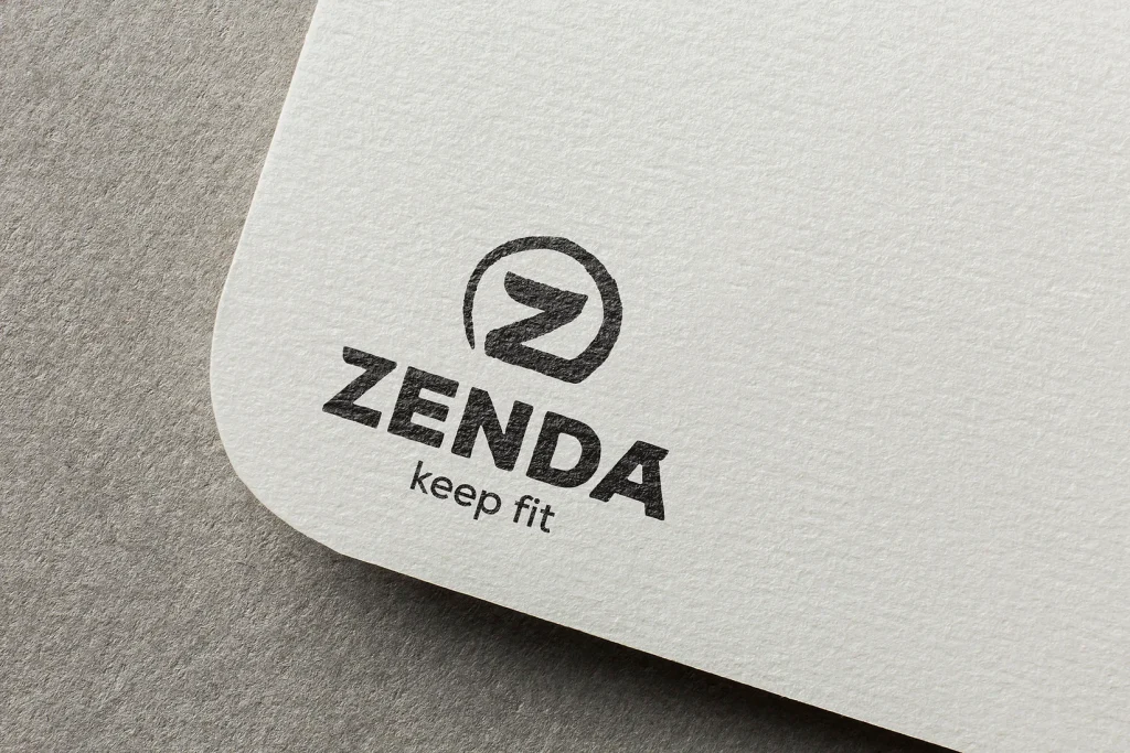
The name Zenda emerged during the brand discovery phase, after mapping the emotional and physical benefits of yoga. The idea of reaching a “Zen” state became the foundation for the naming process. We wanted a word that felt modern, light, memorable, and directly connected to the core experience of yoga: focus, calm and inner alignment. “Zenda” captures this state effortlessly, while also sounding active and contemporary. The tagline Keep Fit reinforces the brand’s commitment to accessible, everyday movement.
For this project, we developed the complete verbal and visual identity. The tone of voice is simple, calming and encouraging, mirroring the rhythm of a mindful practice. Visually, the system is built around clean typography, generous spacing and a minimal color palette, all designed to evoke clarity and stability. Graphic elements are subtle and precise, supporting the idea of balance without unnecessary decoration.

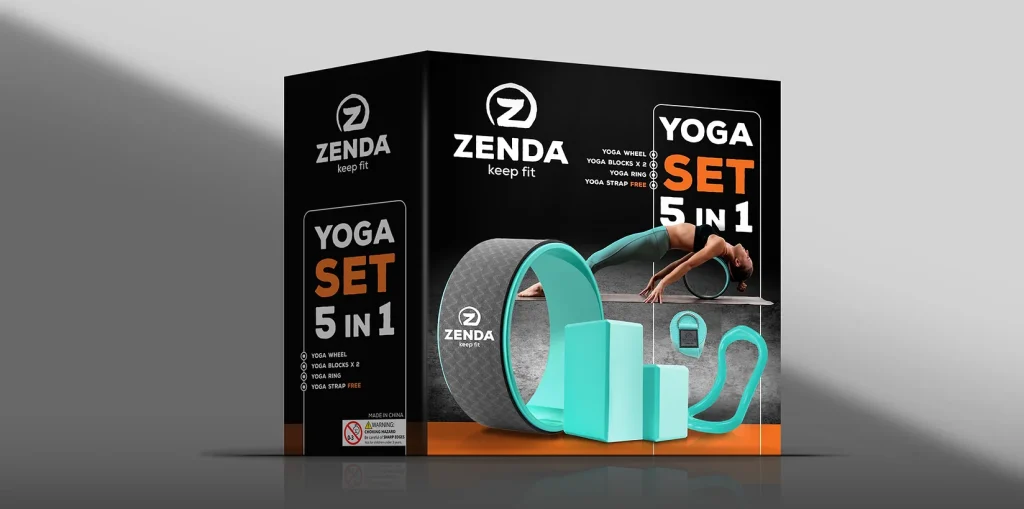
We also created the full packaging design for the product range. The packaging needed to be functional, lightweight and aligned with the brand’s calm aesthetic. We focused on clear product information, tactile materials and a layout that communicates trust and professionalism, while keeping the visual experience serene and modern.
Zenda is a place where functional design meets mindful movement. Every touchpoint — from naming to packaging — is built to encourage people to stay focused, stay balanced and keep fit.