KOKOLAND is a distribution and transport company built on speed, efficiency and consistent quality. We serve the food industry, with a focus on sensitive products that require correct handling, controlled temperatures and a flawless logistics flow. In a market where timing and trust are essential, KOKOLAND positions itself as a reliable transport partner for every delivery.
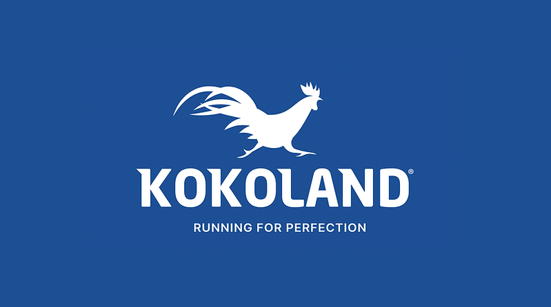
The visual identity is built around a strong symbol: a rooster in motion. The dynamic silhouette expresses energy, agility and discipline. The rooster is a universal sign of rhythm, awareness and a new day starting with focus and order. For KOKOLAND, it becomes the perfect metaphor for a company that begins early, works continuously and maintains a steady, well-coordinated flow. The forward movement suggests progress, precision and constant attention to detail.
The color palette — led by a deep blue — communicates professionalism, responsibility and safety. It is a strategic choice, often used in industries where trust is critical. The typography is solid and balanced, designed for clarity and high visibility across digital and physical applications: vehicles, uniforms, documents and packaging.
The tagline Running for Perfection captures the company’s philosophy. KOKOLAND is not only delivering products. It is constantly improving processes, reaction times and service quality. It is a clear promise to partners: every transport is handled with maximum care, and every kilometer is driven with the same commitment to high standards.
KOKOLAND stands for rhythm, precision and performance. A modern logistics brand built for companies that need safe, fast and predictable distribution.
Running for perfection — delivery after delivery.