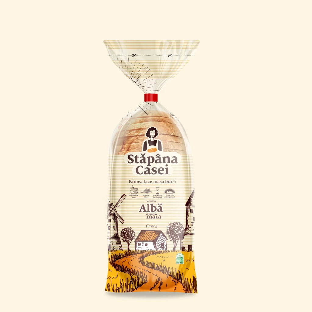
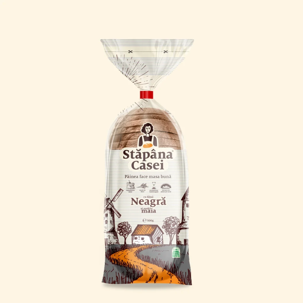
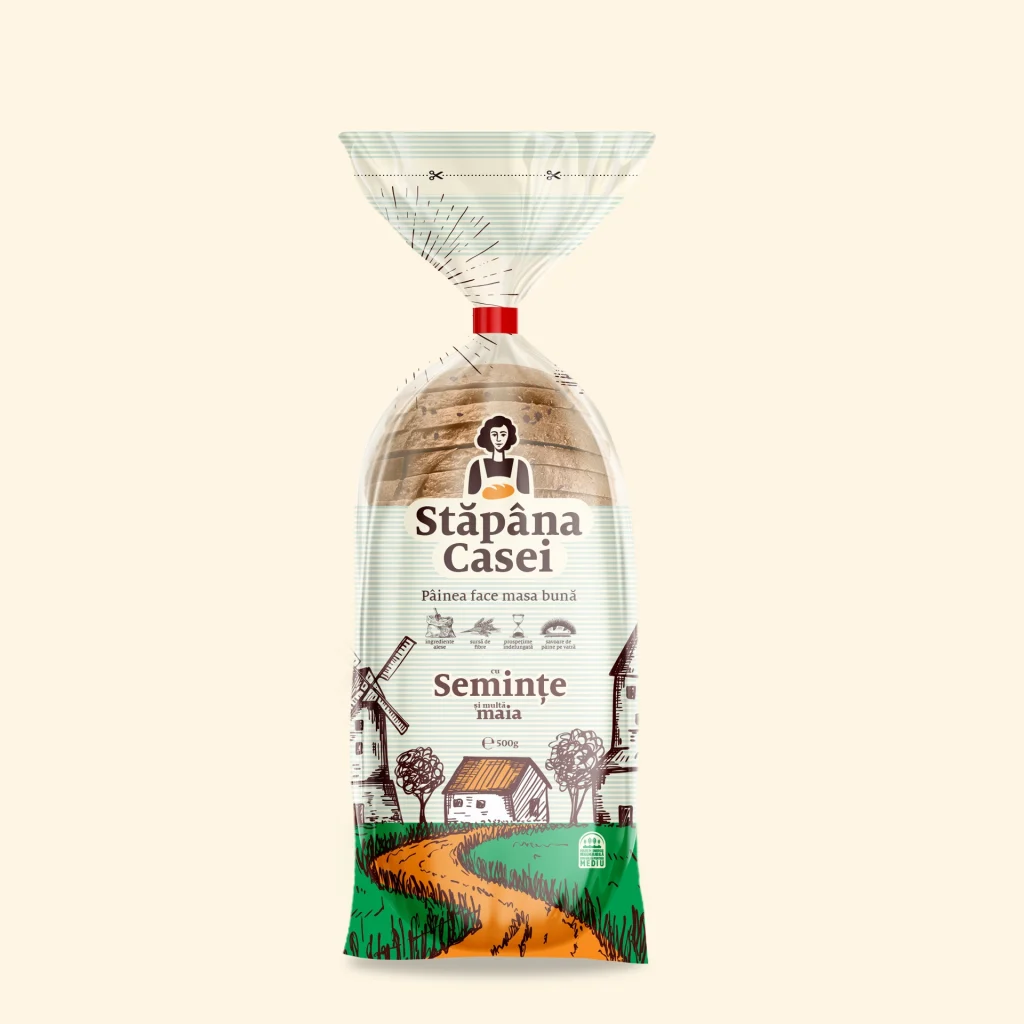
Mistress of the House (Stăpâna Casei) is a bakery and confectionery brand dedicated to lovers of traditional, authentic products. It celebrates the timeless values of care, dedication, and craftsmanship passed down through generations. The visual identity is built around the archetype of a woman who puts her soul into everything she does—for the joy and well-being of her family. She is a symbol of resilience, love, and quiet strength.

The color palette is warm and natural, inspired by the textures and tones of the earth, grains, and oven-baked goods. The chosen typography is both legible and consistent, grounding the brand in familiarity while maintaining a refined and classic touch.
The entire identity is a heartfelt tribute to the women who are the silent engines of their homes—strong, beautiful, and unwavering. These are the women who nurture, guide, and support. The Mistress of the House is more than a brand character—she’s the pillar on which the family leans. Through a blend of passion, wisdom, and instinct, she keeps traditions alive while nurturing future generations.
The packaging design for Stăpâna Casei bread captures this emotion with grace and sincerity. The illustrated landscape tells a story: at the heart lies the home—modest, warm, and welcoming. A golden wheat field stretches in front, with a gentle path leading to the door. To the left, a traditional mill nods to craftsmanship and time-honored methods; to the right, a small church signifies faith and continuity. Above it all, the open sky offers a sense of peace, with the sun and clouds watching protectively from above.
Every visual element was designed to evoke a sense of belonging, tradition, and care—because bread, like love, is best when it comes from the heart.
Mistress of the House is more than a brand—it's a story baked into every loaf, a symbol of love passed from hand to hand, generation to generation.