How we started the Nixodor Branding Process. A whole lotta Beethovens, Lassies, and Aristocats, or the market context. The worldwide pet census recorded over 600 million cats and over 500 million dogs. Meaning registered pets, homed, loved, and cared for as a family. And obviously, people go out of their way to offer their fun and furry "children" the best, happiest, and healthiest life.
Much to the delight of our four-legged friends, in Romania and elsewhere, a pet-loving company recently launched NIXODOR. A dietary supplement that prevents the most common health problems - those of the digestive tract.
Mixed in the pets' regular food, NIXODOR helps boost immunity, maintain intestinal flora, improve the look of skin and fur, and - most importantly perhaps - has an instant effect in reducing the smell of "leftovers" we collect from parks, litterboxes or (ugh!!!) carpets.

Brand identity. NIXODOR is a natural dietary supplement recommended by veterinarians. So it has high credibility. Moreover, the product is created and manufactured in Austria, and our client wanted to pinpoint the Teutonic rigor and precision in the brand communication.
The verbal identity is descriptive, created by juxtaposing the particles "nix" (word meaning "zero, nothing", of Germanic origin, but currently spread worldwide) and "odor" (from the French "odeur" and the Anglo-American "odo(u)r", borrowed in Romanian from Latin and initially meaning "smell").
NIXODOR brand name highlights the product's special benefit - the absence of excrement unpleasant odor - transcending linguistic and cultural boundaries to address buyers in all markets.
Happy tails on the net. Promotion campaign. The NIXODOR logo visually conveys the medical, serious nature of the product. The lettering, simple and clear, express the supplement's lab-like precision. The thick-and-thin alternation of font styles shows the two components, decoding the brand name's meaning.
The usage of capital letters facilitates reading both horizontally and vertically so that the logo remains readable across various communication media.


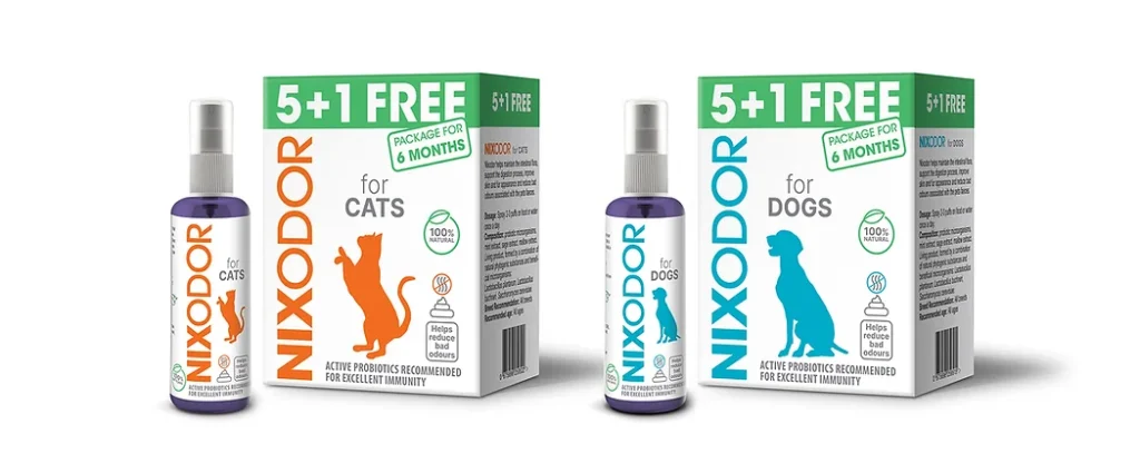
The packaging allows for quick cat vs dog product differentiation, both on shelves and online. Chromatically speaking, orange suggests playfulness, curiosity, energy, and grace specific to felines, while blue - canine loyalty and intelligence.
The figurative elements identify, once again, each product's furry consumer, while keeping brand rigor.
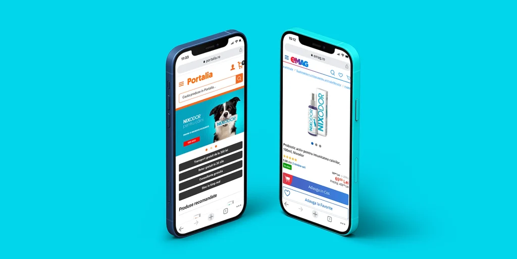
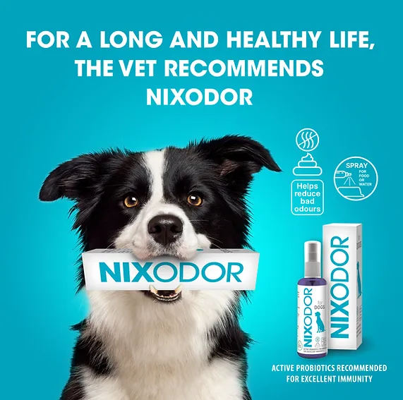
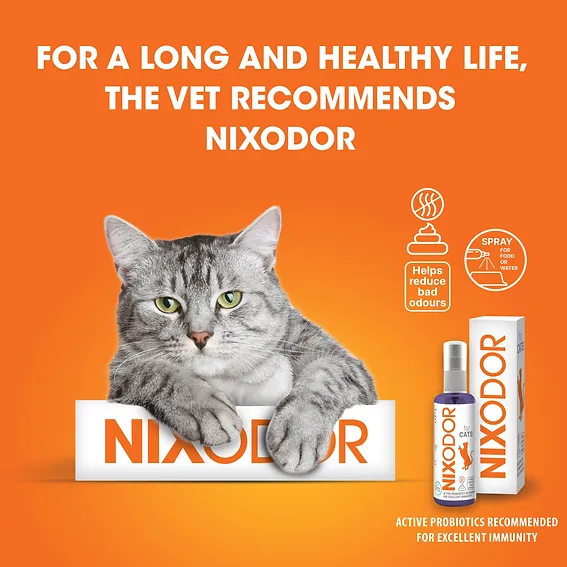
In addition to vet offices, NIXODOR is sold online, on eMag in Romania, and on Amazon internationally. Therefore, the launch and promotion campaigns are deployed mainly online, featuring colorful visuals, meows, woofs, and a whole lotta fun, with zero unwanted odors.
And if Didona, the Logo Bigger agency doggie, will ever get to Tik Tok, she'll surely upload a five-star video review for NIXODOR, and we'll gladly back her up. Have a woofy day!