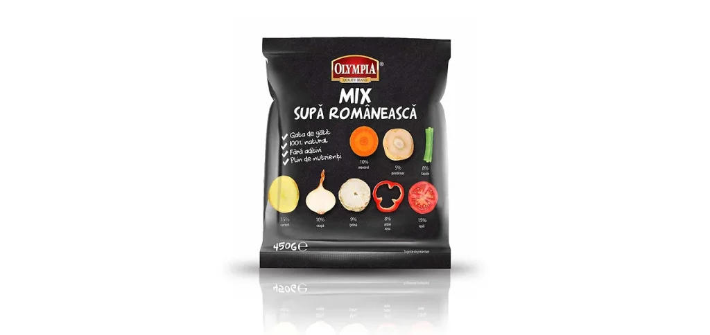
Maybe a picture is worth a thousand words, but, in the same manner, we could say that tasty food can leave you speechless. We created a minimalist, but modern design which highlights the product ingredients in a natural way.
The minimalist design wasn’t a simpler choice, but a bold one. All markets brawl with the most eye-catching colors, with tons of ingredients and fancy cutlery.
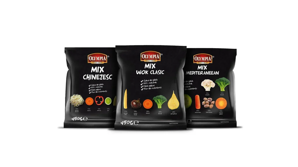
The Olympia frozen range was designed to stand out instantly on the shelf. While most competitors use light and pastel colors, we built the entire line on a bold black background. The contrast is intentional: black elevates the products, reinforces the idea of premium quality, and creates a strong visual presence in a crowded category.
The design focuses on clarity and high perceived value. Each pack features clean typography, generous negative space and high-quality food photography. The black base enhances the colors of the ingredients, making the products look fresh, vibrant and appetizing. The result is a modern, confident identity that communicates trust, precision and superior quality.
The overall concept positions Olympia as a premium choice in the frozen food segment — a brand that promises better taste, better ingredients and a higher standard of presentation.