"Man is the measure of all things," says a quote from Protagoras, and ProHumano Plus as a brand wants to support humans in all our activities.
Adding the graphic symbol + to this resonant name, the textual representation of the idea behind the brand was born immediately: Everything for people. And something extra.
We chose for the development of the logo a geometric font, regular, rounded at the corners, and symmetrical, which offers confidence and support, which is legible and integrable: Nexa Bold.
The letter "o" is a perfect circle, a detail that we found relevant in choosing this font. In fact, the perfection of the circle was incorporated even more in the finalization of the logo: we added to the writing a series of concentric circles, in gradients, which expand from the very last "o" of the brand name.
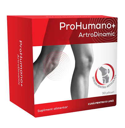
That pain restricts your mobility. That's why I associated the product with the color red.
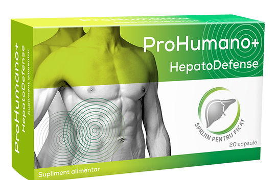
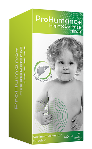
HepatoDefence turned green. I went for a palette of warm, inviting, soothing colors that are never violent. HepatoDefense regenerates liver cells and helps maintain their health.
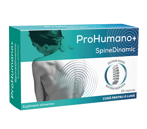
SpineDinamic knows every detail of back pain. SpineDinamic restores your balance. SpineDinamic blue is a stable, comforting, and persistent one. Just like the help that the product offers you.
We illustrated the perfection of the human body down to the smallest detail, together with the photographer Matei Buta, with whom we arranged a photo shoot with professional dancers. Being an art based on balance, delicacy, and beauty, ballet was the ideal choice.